Lorem ipsum dolor sit amet, consectetur adipiscing elit. Nunc odio purus, tempus non condimentum eget, vestibulum.
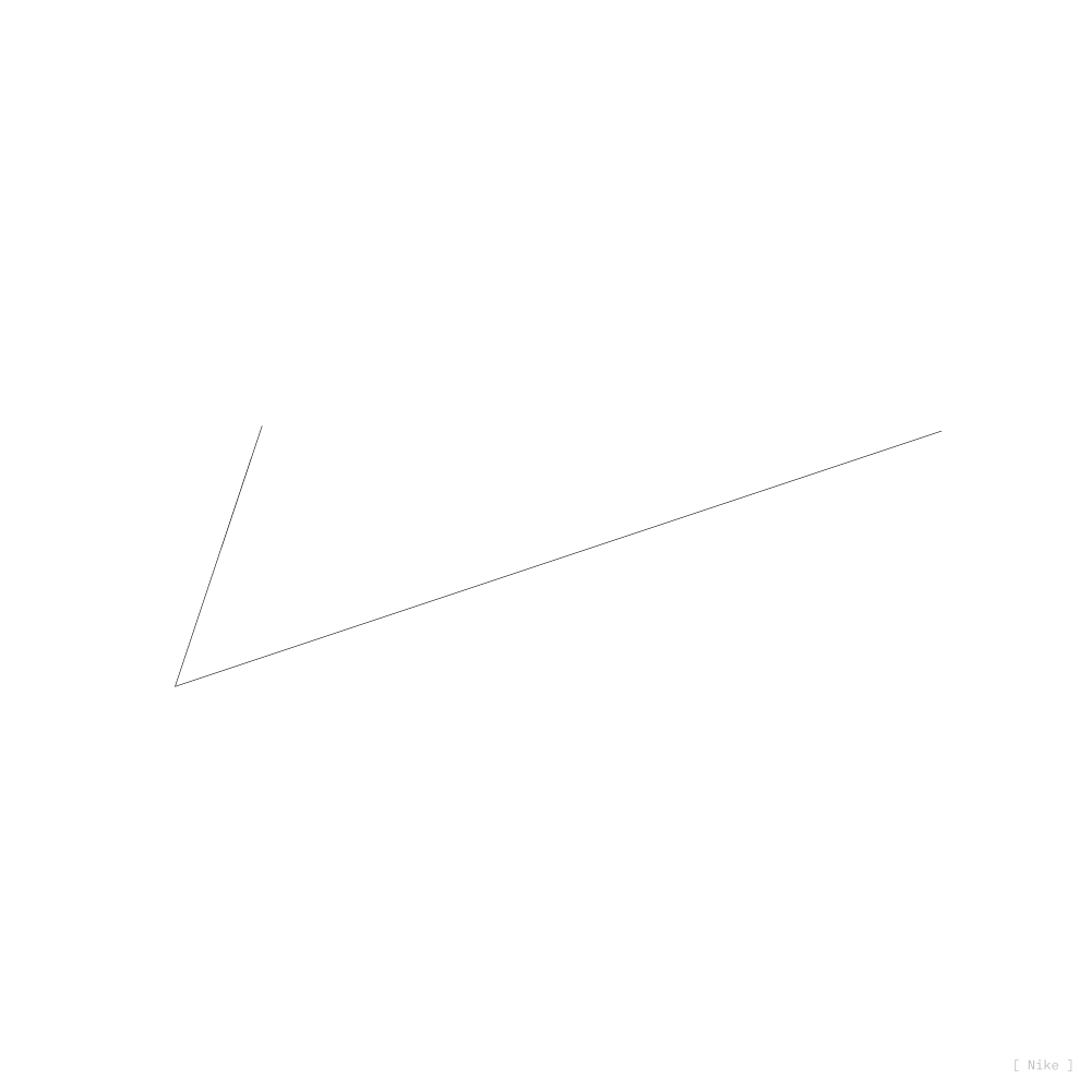


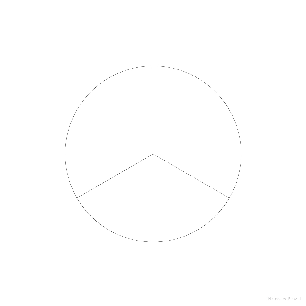
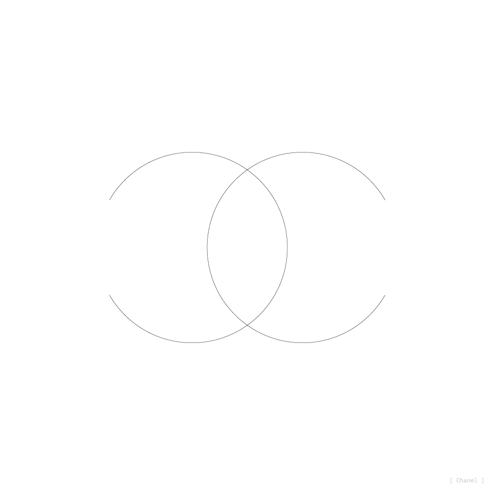
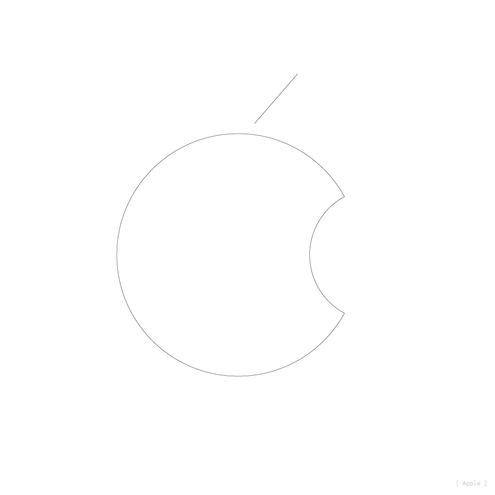


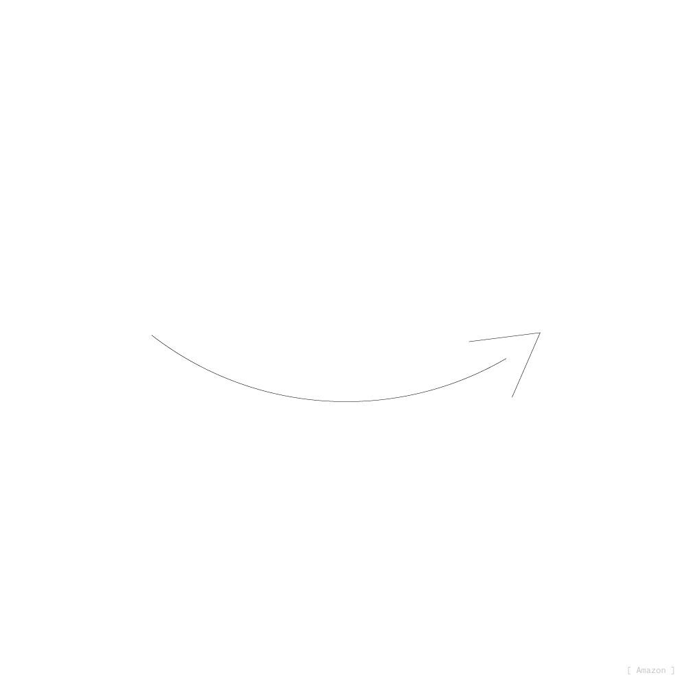


In my never ending observation of minimalism and its viable applications to the modern world, I started to wonder: what would some of the world’s most famous brand icons look like when reduced to mere lines. No colors. No text. Just a logo mark boiled down to its foundational basis—its linear core.
It started with the Nike swoosh. If only straight lines and perfect circles could be used, would the Nike logo still be recognizable? And if it was still recognizable or not, is that important? Should these linear x-rays be considered when designing future icons? What if different logos shared the same linear breakdown?
This page is the beginning to finding answers to some of these questions. What you see here is a roundup of various line logos.
Can you recognize each brand?