Lorem ipsum dolor sit amet, consectetur adipiscing elit. Nunc odio purus, tempus non condimentum eget, vestibulum.
In 1917, Mondrian, along with some other artists of the time, started the Die Stijl (Dutch for “The Style”) movement. It was a style of abstract art that combined cubism and futurism, and aimed to influence a peaceful society after World War I. I’ve always been drawn to simplicity and geometry, so Mondrian’s work had a natural allure for me.
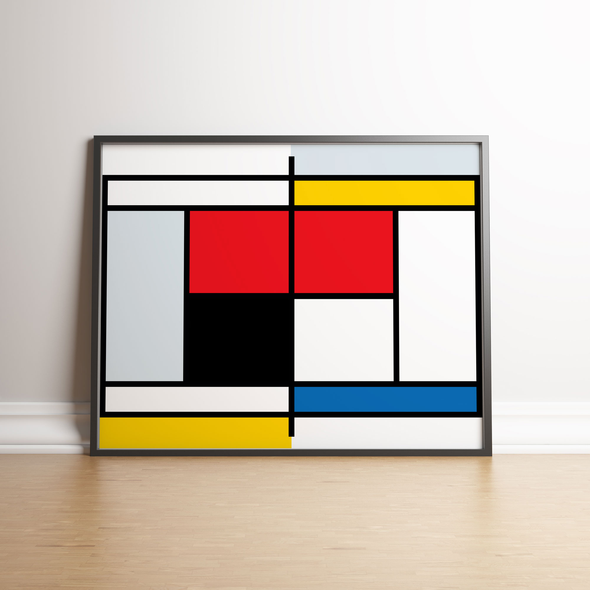
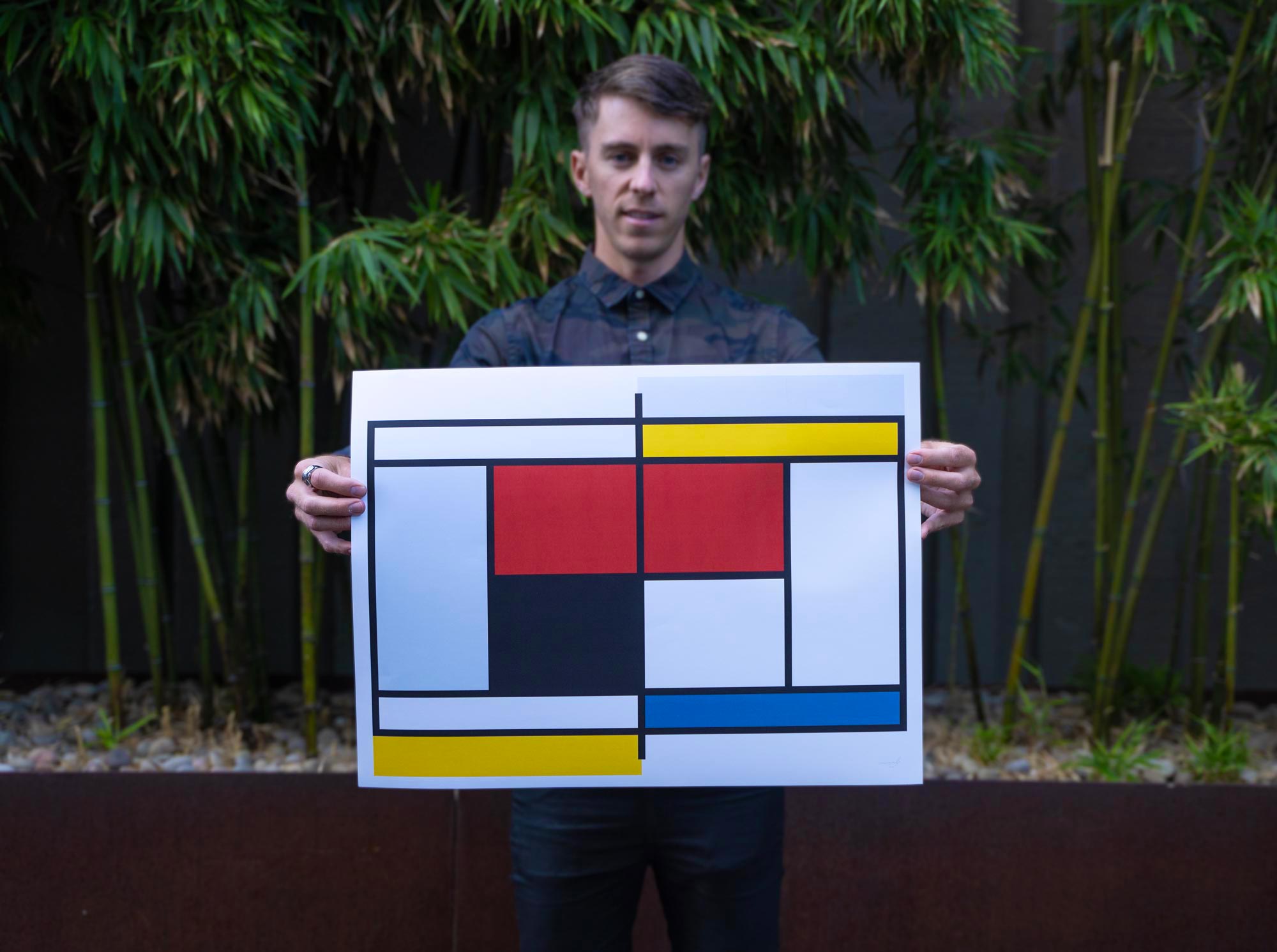
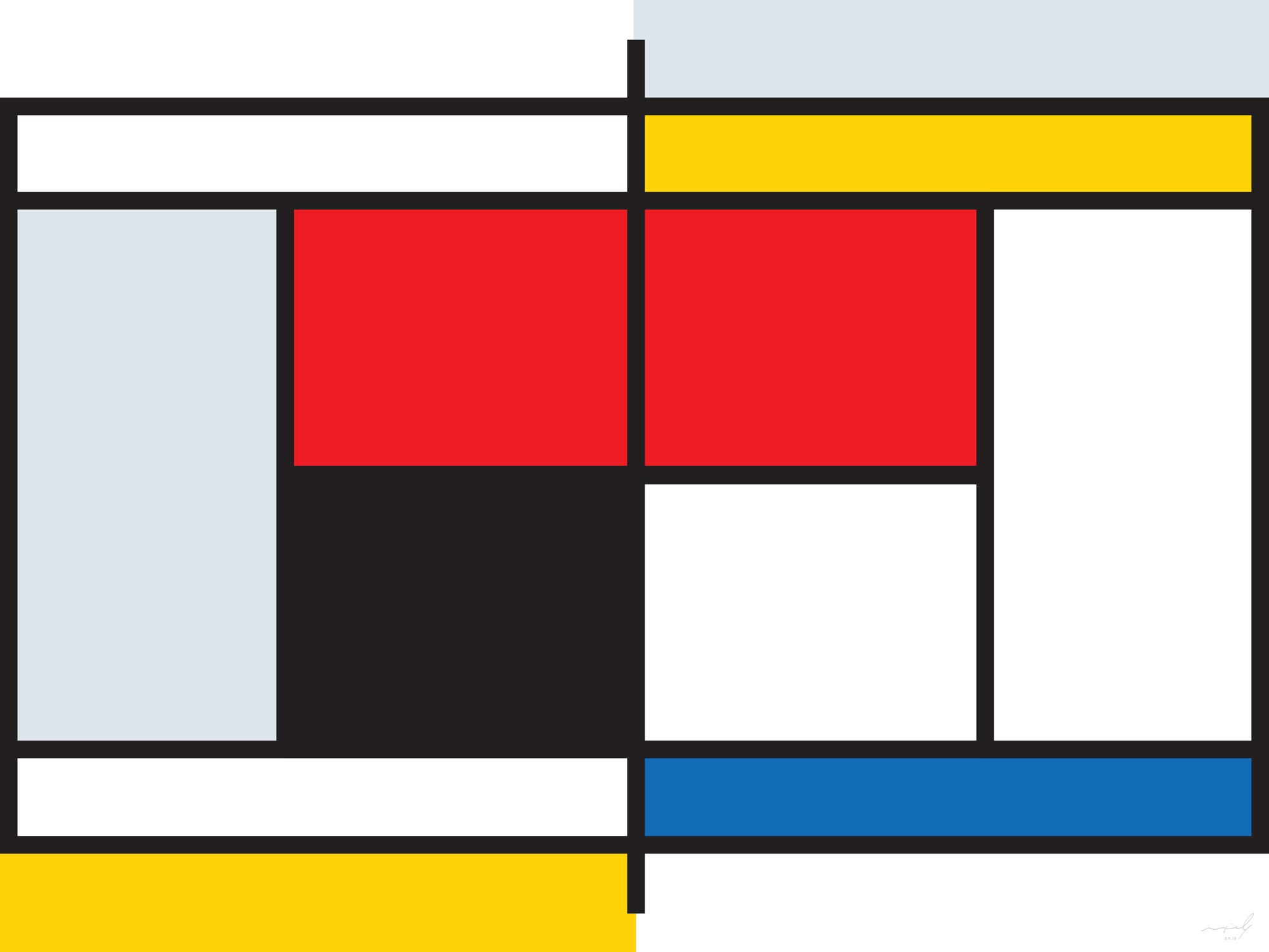
One day I was noticing the design of the World Team Tennis courts. The colors are heinous, but the idea of recoloring the different areas within the court was interesting to me and almost instantly led me to think of Mondrian’s paintings. Convinced it had surely already been done, I set out to find and purchase some art of a Mondrian-style tennis court. Surprised I couldn’t find anything, I made it myself.
Replacing Mondrian’s lines with the lines of a tennis court and then applying his Die Stijl color palette, I was able to create a poster that combined my passions: art and tennis. I must admit, I spent a lot of time placing the different primary colors in the various areas to try to get it just right. Mondrian’s ability to simultaneously achieve asymmetry and balance is brilliant, and I can fully appreciate it after failing so many times. Eventually, I used his painting “Composition with Large Red Plane, Yellow, Black, Grey and Blue (1921)” as a guide for color placement and my poster was complete.
Maxime Liberty-Point
Graphic Design