The Situation
When I first met with GrandCanals, the silicon valley-based fulfillment software company was ready for a revamp. And they didn't just want an overhaul of the brand, they wanted a new name, too. While some light name-storming had begun before we were brought in, my team worked quickly to contribute a myriad of names for their consideration. It was a close contest, but the winning name would be a condensing of their old name
Grand Canal Solutions to
GrandCanals.
After the company's new, streamlined name was finalized, it was time for the rebrand.
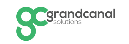 [ Old Name & Logo ]
The Icon
After working with GrandCanals to understand their core values and their unique approach to analytics-driven fulfillment, I was able to develop some concepts for review.
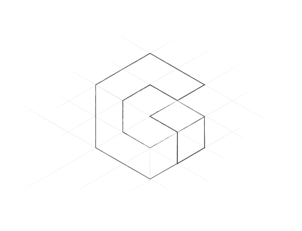 [ Cube Concept ]
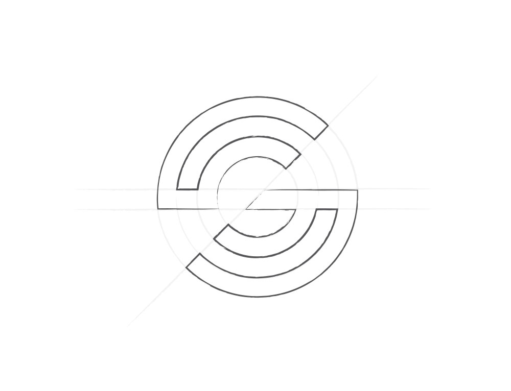 [ Rings Concept ]
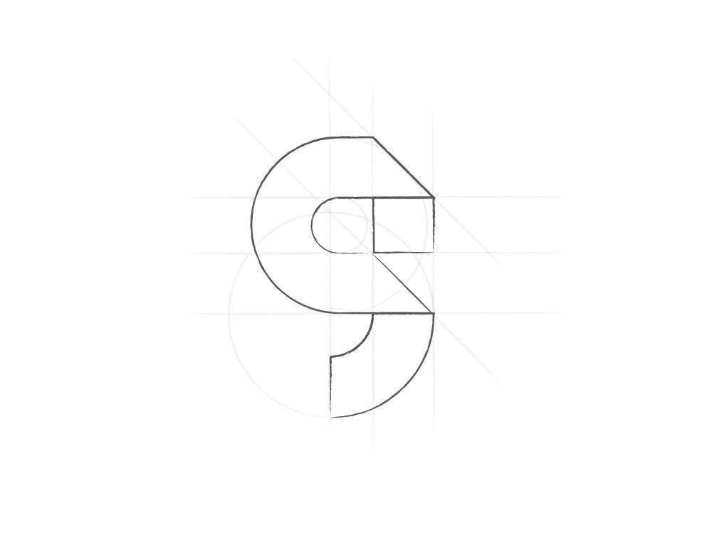 [ Fold Concept ]
The Rings concept would be their favorite. The “G” and the “C” letters are worked into circular paths that were inspired by a recent trip to Amsterdam where the curved water canals act as key pathways around the city. This logo mark aims to convey integration and connectedness while also communicating the company’s omniscient vision and versatility.
While not many adjustments were made to the initial design, choosing the colors proved to be the hardest part.
 [ Final Color Options ]
The Colors
We knew the logo would be two-tone, but there wasn't a clear winner in terms of which two colors to use. After numerous color reviews we finally landed on a simple turquoise-slate combination. I loved this choice for two reasons:
- because turquoise carries the emotional traits of green and blue (trust, intelligence, technology, finance and prestige), and
- the turquoise with dark grey combination adds a geographical component to the brand as it is a subtle homage to the local pro hockey team, the San Jose Sharks.
 [ Final Logo Icon ]
The Logotype
The logotype uses a font designed by Levi Szekeres called “Fashion Fetish.” This font was chosen for its circular qualities and its complimentary weight. It‘s simple and professional.
 [ Final Logotype ]
The Results
 [ Final Logo Horizontal ]
 [ Final Logo Vertical ]
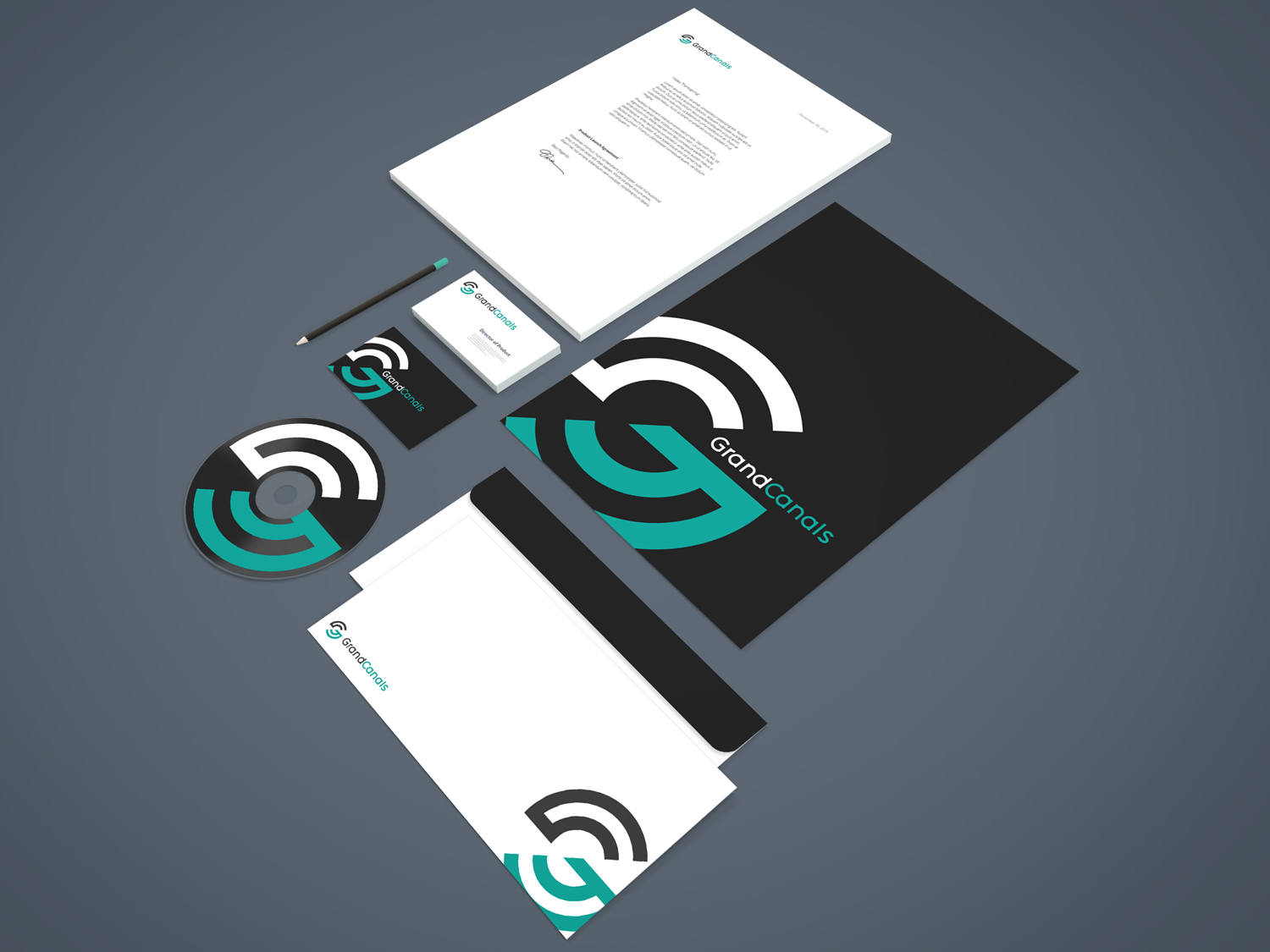
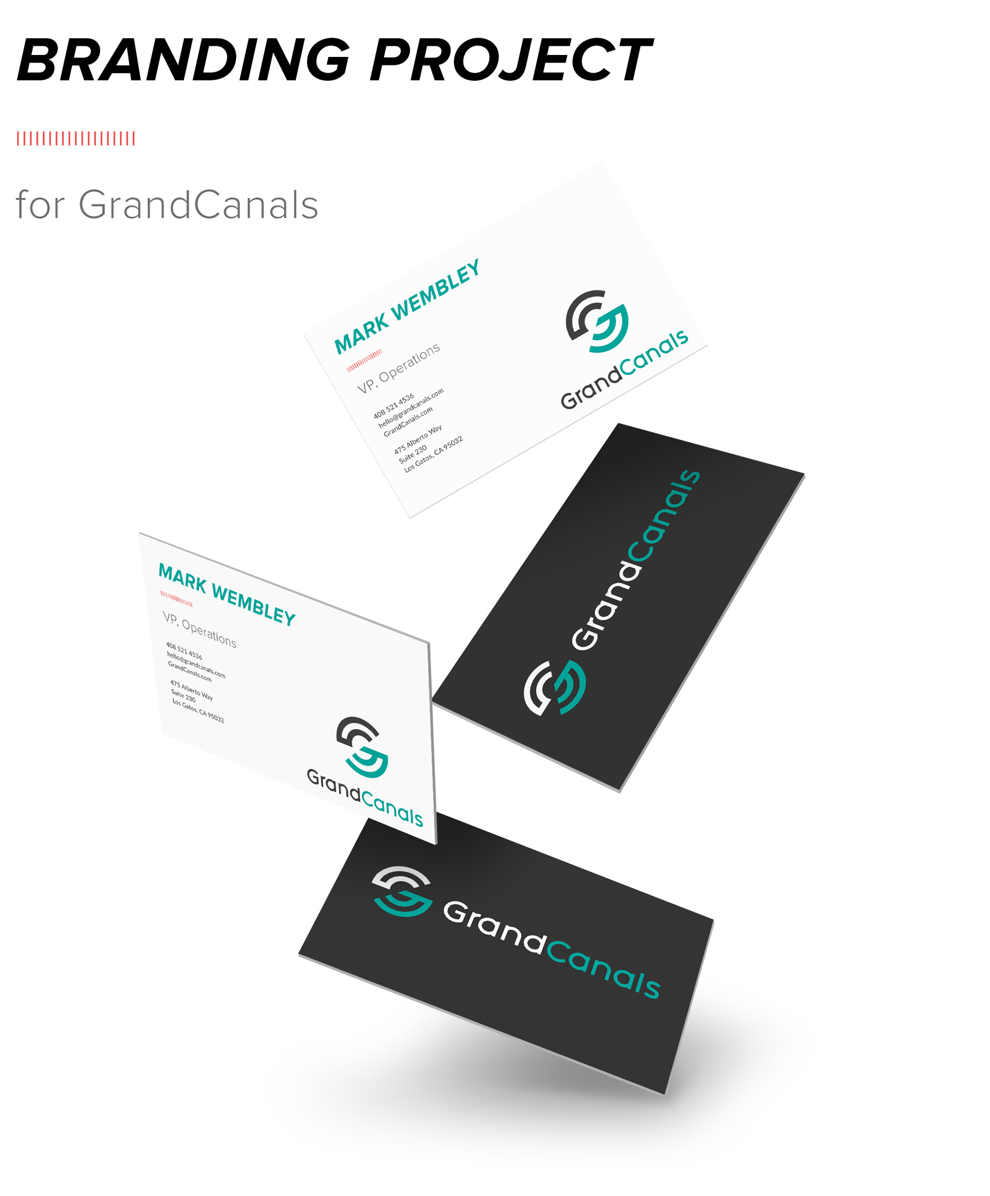
[ GrandCanals Stationary Mockup ]
The Fonts
Titles and subtitles use a font called “Proxima Nova,” designed by Mark Simons Studio. GrandCanals uses this font in various weights and styles with different kerning and line-heights, but all looks can be achieved with the Proxima Nova font family and some specific tooling.
The dashed line is a visual element that helps distinguish titles by always appearing below the title text. Its design is derived from the perforated lines on a map that notate a path.
The CTA font is the boldest of all and has the widest kerning to truly separate it from all the other text. The body font is "Lato," a free webfont offered by Google.
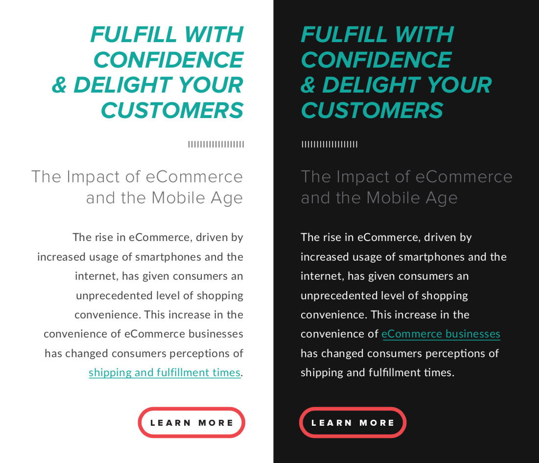
[ GrandCanals Fonts ]
The Visuals
The GrandCanals visual scheme is a way to beautifully brand photography and other imagery. This treatment is achieved by layering the GrandCanals logo mark on top of a colorized image, scaling the logo mark up, and placing text on the areas that the logo mark now occupies.
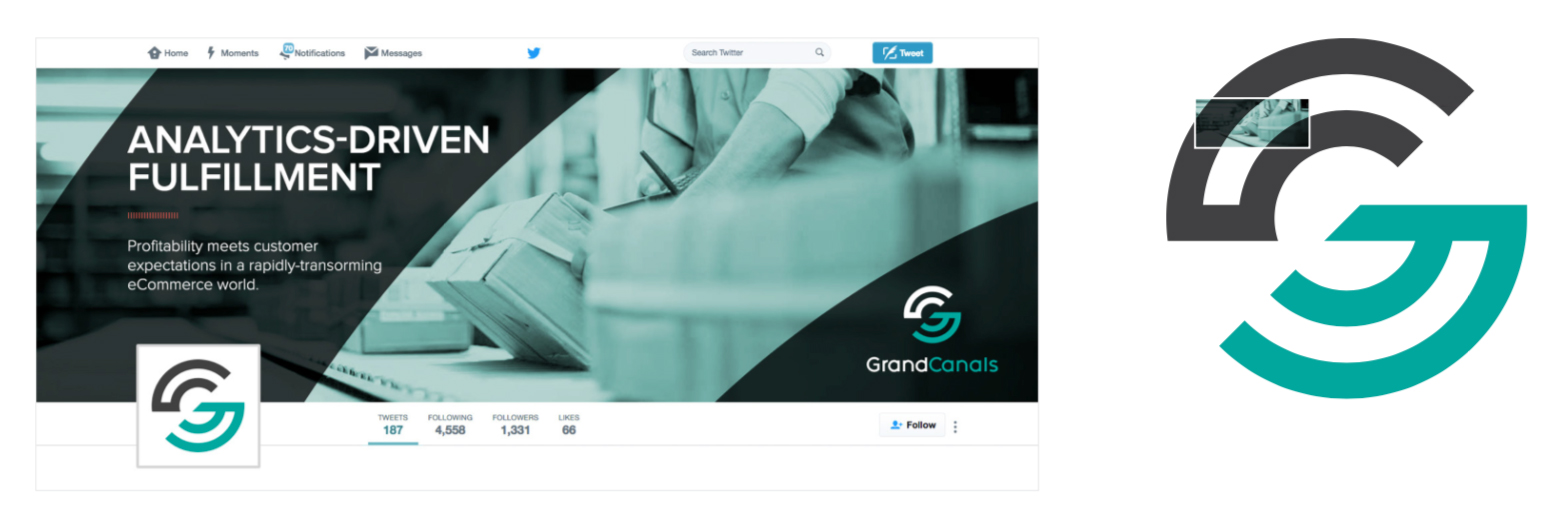 [ Visual Scheme Application - Twitter Banner ]

[ Visual Scheme Application - Street Billboard ]
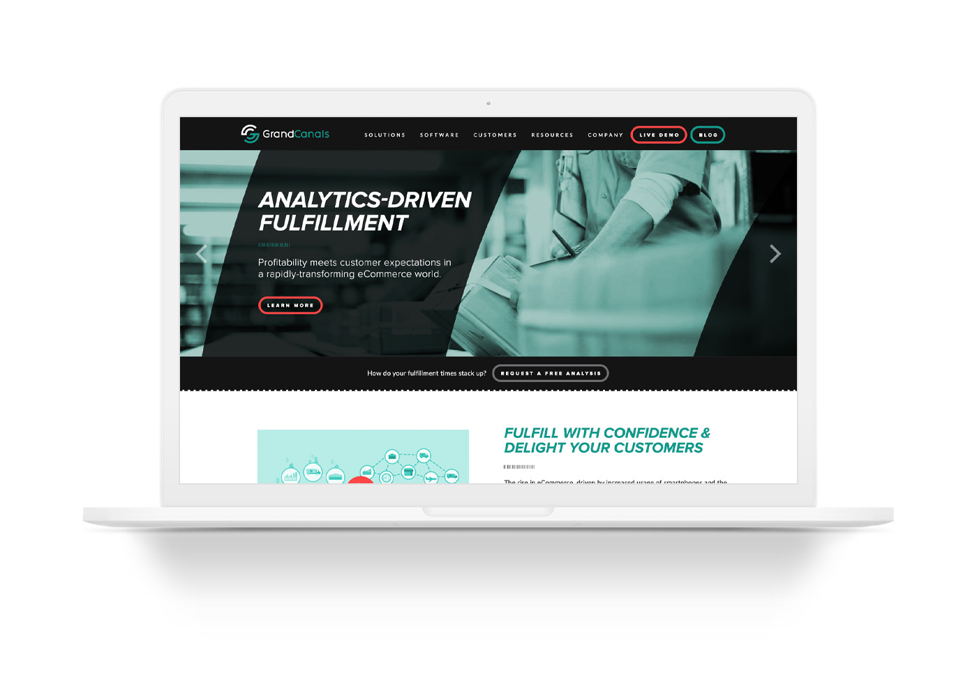 [ Visual Scheme Application - Website ]
SEAN WILCOX
VP, Marketing,
GrandCanals
"Working with Max on GrandCanals' rebrand was an absolute pleasure. He showed creativity and originality throughout the project while being open to our feedback. We are delighted with our fresh, modern logo and visual identity as it continues to represent us well and show its strength across all sales and marketing materials."


 [ Old Name & Logo ]
 [ Cube Concept ]
 [ Rings Concept ]
 [ Fold Concept ]
 [ Final Logotype ]
 [ Final Logo Horizontal ]
 [ Final Logo Vertical ]


 [ Visual Scheme Application - Twitter Banner ]

 [ Visual Scheme Application - Website ]