The Situation
When I first met Lacework, the cloud security company was still in stealth, but their launch date was fast approaching and their brand and website practically non-existent. They were surviving on a crude hexagonal logo design and a very raw single-page website, but they knew they needed something better for the company launch. Their logo would need to be recognizable, versatile, and beautiful. And their website would need to gracefully communicate their product while simultaneously reinforcing a new brand.
 [ Old Logo ]
The Strategy
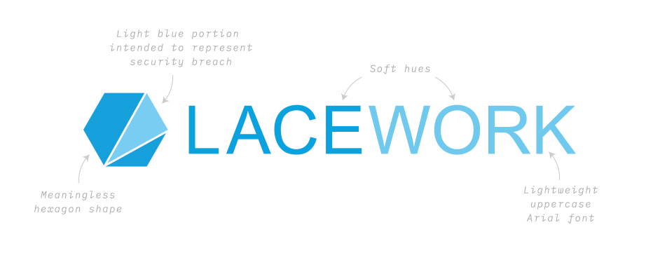
With only one month until company launch, it was crunch time. I sat down with the CEO and founders at Lacework and learned some valuable insight around the company and their technology. After they explained that there was indeed meaning in their old hexagon logo, I knew a revision of the concept was most sensible and offered the best chance at meeting the aggressive deadline. When describing their original logo, the founders explained that the light blue triangle within the hexagon shape represented a breach within a system, which is what Lacework’s technology does. Armed with a sound concept, I set out to revise and elevate the old logo mark into a design that was not only appealing, but also effective.
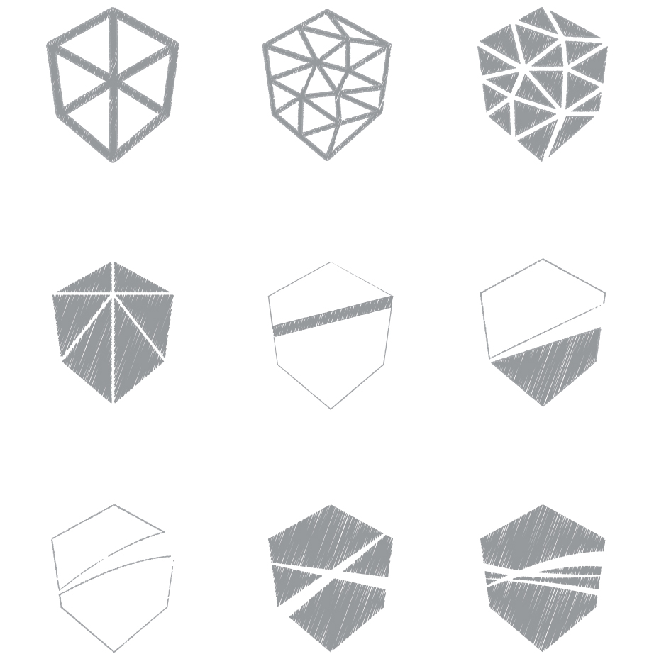 [ Shield Brainstorm ]
 [ Final Shield Shape ]
The Icon
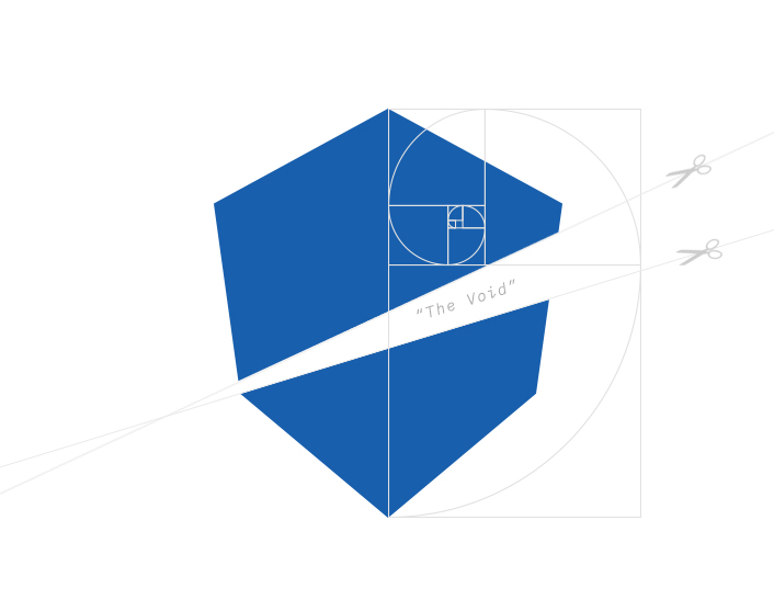
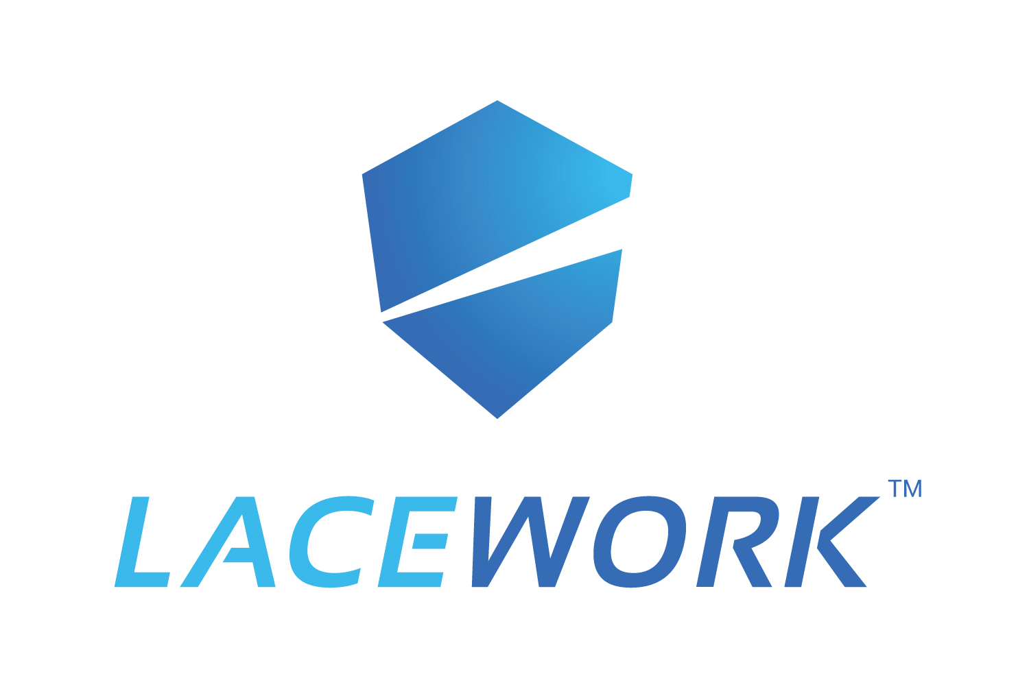
After considering various shapes, the Lacework shield shape was achieved by simply rotating the original hexagon and repositioning the different points. And instead of using a colored streak to illustrate the system breach, a piece of the shield was removed all-together. This empty slash would eventually be referred to as “the void” and used further as a visual scheme for Lacework’s branded imagery.
The last step was coating the shield with a shiny blue gradient with hues that invoke power, trust, and professionalism—important qualities when considering cybersecurity solutions.
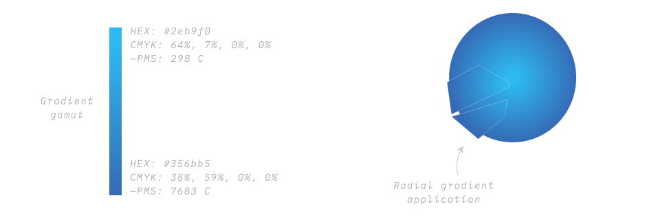 [ Gradient Application ]
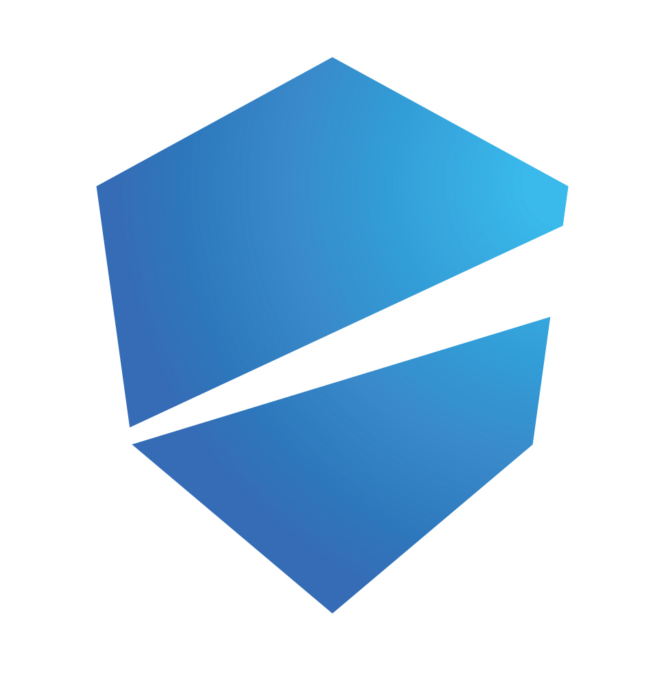 [ Final Shield Logo Icon ]
The Logotype
The accompanying logotype would need to supplement the new logo mark by sharing the same strong qualities as the shield, but also be able to represent the brand when standing alone. I set Lacework’s new logotype in the bold and italicized Sansation font by Bernd Montag. This font echoes the brand beautifully with a strong weight, forward leaning stance, and scattered points of disconnection. A modification to the letter “E” and some kerning would be the only changes to the original font.
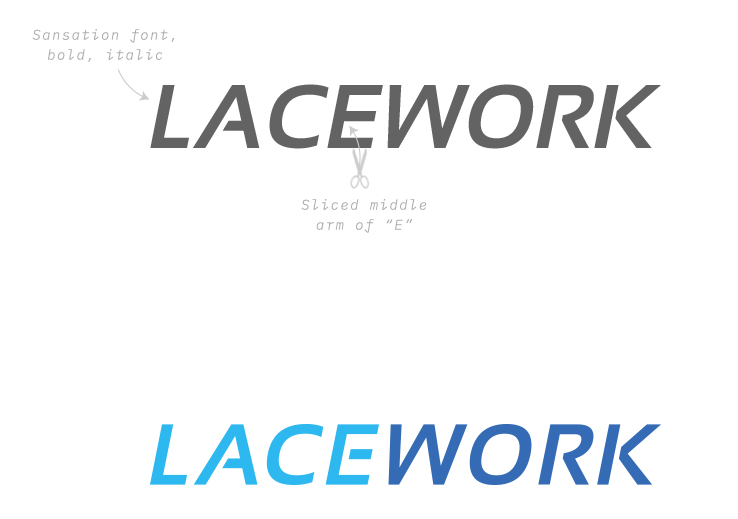 [ Final Logotype ]
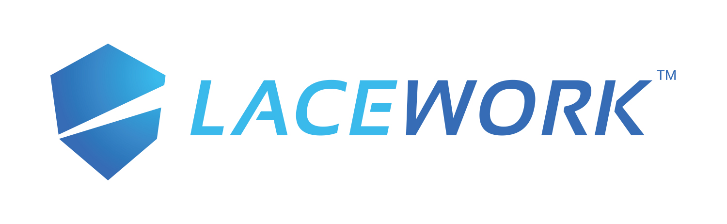 [ Final Logo Horizontal ]
 [ Final Logo Vertical ]
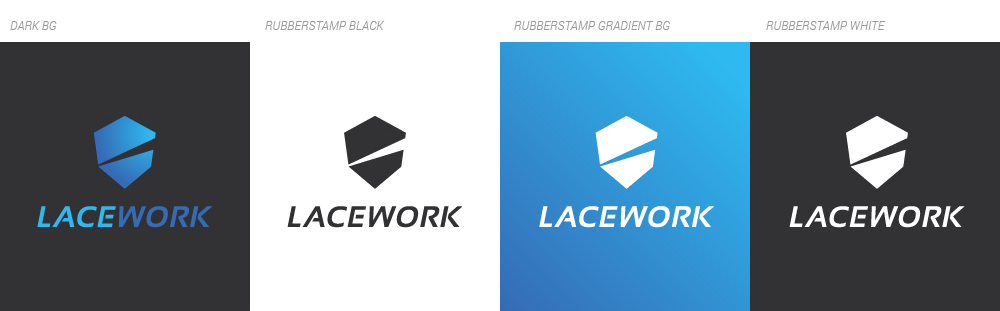
[ Available Color Treatments ]
 [ Lacework Business Cards ]
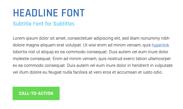
Rajdhani by Indian Type Foundry is used for the headline, subtitle, and CTA fonts. The letterforms are modularized and their squared, condensed appearance evokes a sense of technology. The neo-grotesque sans-serif font, Roboto by Christian Robertson is the general body font.
 [ Font Hierarchy ]
“The Void”
As a visual mechanism for the company to use in marketing materials and elsewhere, I thought “the void” (mentioned earlier) would work as a versatile graphic device. By using the shape as a mask to reveal relevant imagery, Lacework could further reinforce the idea that their product reveals information to the user.
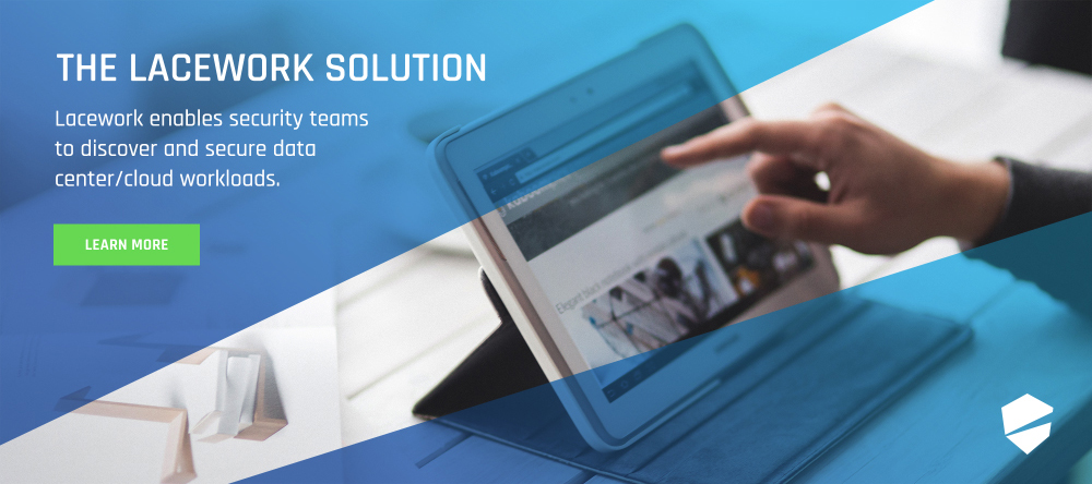
[ Web Banner with The Void ]
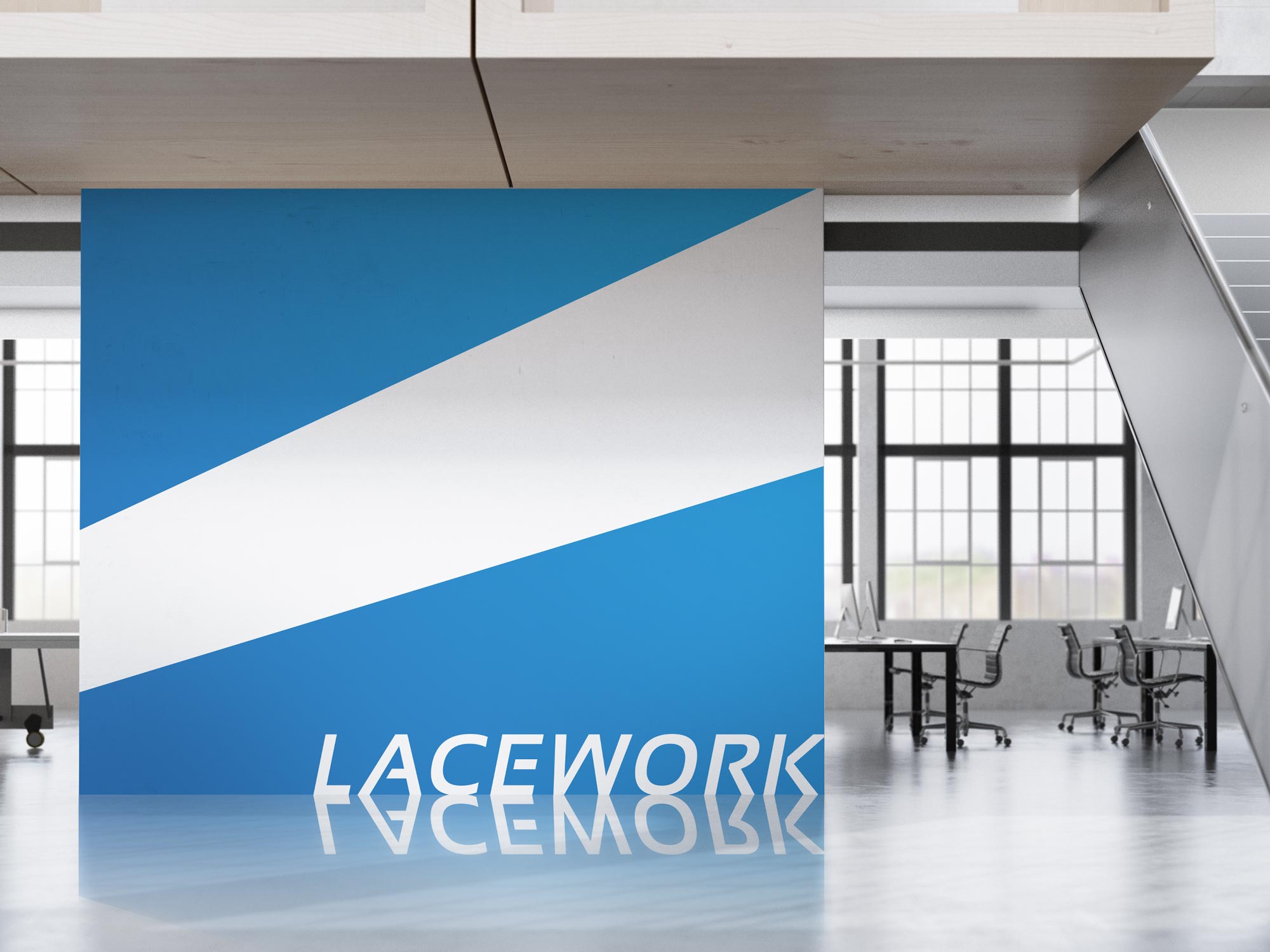
[ Office Wall with The Void ]
Lacework’s new website had one major goal: to drive people towards a free trial of their product. With this in mind, every single page of the site would feature a “Free Trial” button at the top and bottom of the page as well as in any area that spoke to the product directly. Lacework’s new brand combined with clear CTA’s and valuable information and assets culminated into an online experience that was easy to use, attractive, informative and effective.
[ Lacework Website Design ]
SANJAY KALRA
Co-Founder & Chief Strategy Officer,
Lacework
“Our brand and logo have been a key part of our success as a company. We ended up with a visual identity that reinforces our traits as a security company and distinguishes us in the industry. Max showed inventiveness and creativity throughout the process and worked quickly and seamlessly to surpass our expectations.”
 [ Lacework Company Launch Party ]