Lorem ipsum dolor sit amet, consectetur adipiscing elit. Nunc odio purus, tempus non condimentum eget, vestibulum.
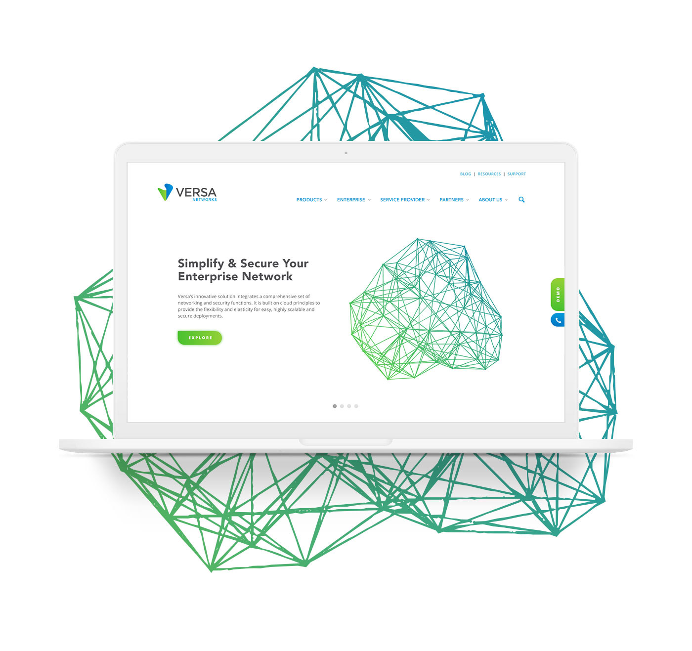
As part of a proposal for Versa Networks, I preemptively redesigned their homepage so they could easily get a sense of not only my design aesthetic, but more importantly, a direct view of what improvements I recommend.
Their current homepage, like many tech companies, is high on content and low on design. Versa has a lot of great things to say, but it’s being impaired by weak web design. Proper spacing, alignment, type hierarchy, CTAs, color palette, imagery, and functionality all contribute to a visitor’s ability to absorb the content. And that’s the true purpose of a website: communicate a message gracefully and effectively.
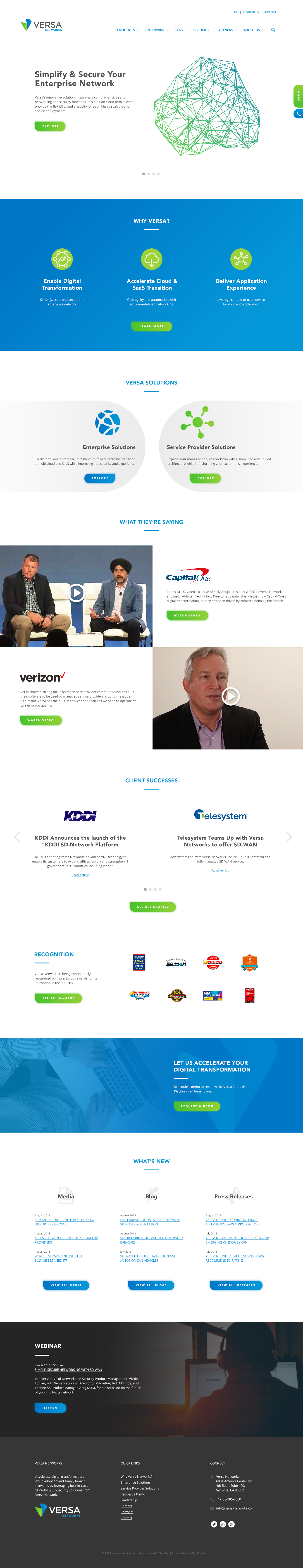
A big part of my redesign of their homepage was adding some visual breathing room. Spacing out the elements on the page lets a visitor easily decipher different sections of the web page and as a result, find the information they’re looking for more easily. The average attention span of a human (8 secs) recently fell below that of a goldfish (9 secs), so visitors don’t want to spend any extra time digging through pages for what they need.
I also consolidated the page’s color palette. This helps reinforce the brand and creates a unique visual environment for the visitor to associate with the company. It should feel obvious to a viewer when they leave one company’s website and enter another.
The last major design change worth noting is the reorganization of the content. There isn’t much time to waste on a homepage, so important information needs to live towards the top. If you aren’t answering a visitor’s question early in their scroll journey, they may just leave all-together.
Maxime Liberty-Point
Versa Networks