Branding
/
Web
/
AsTech Branding
(
3
)
/ About the project
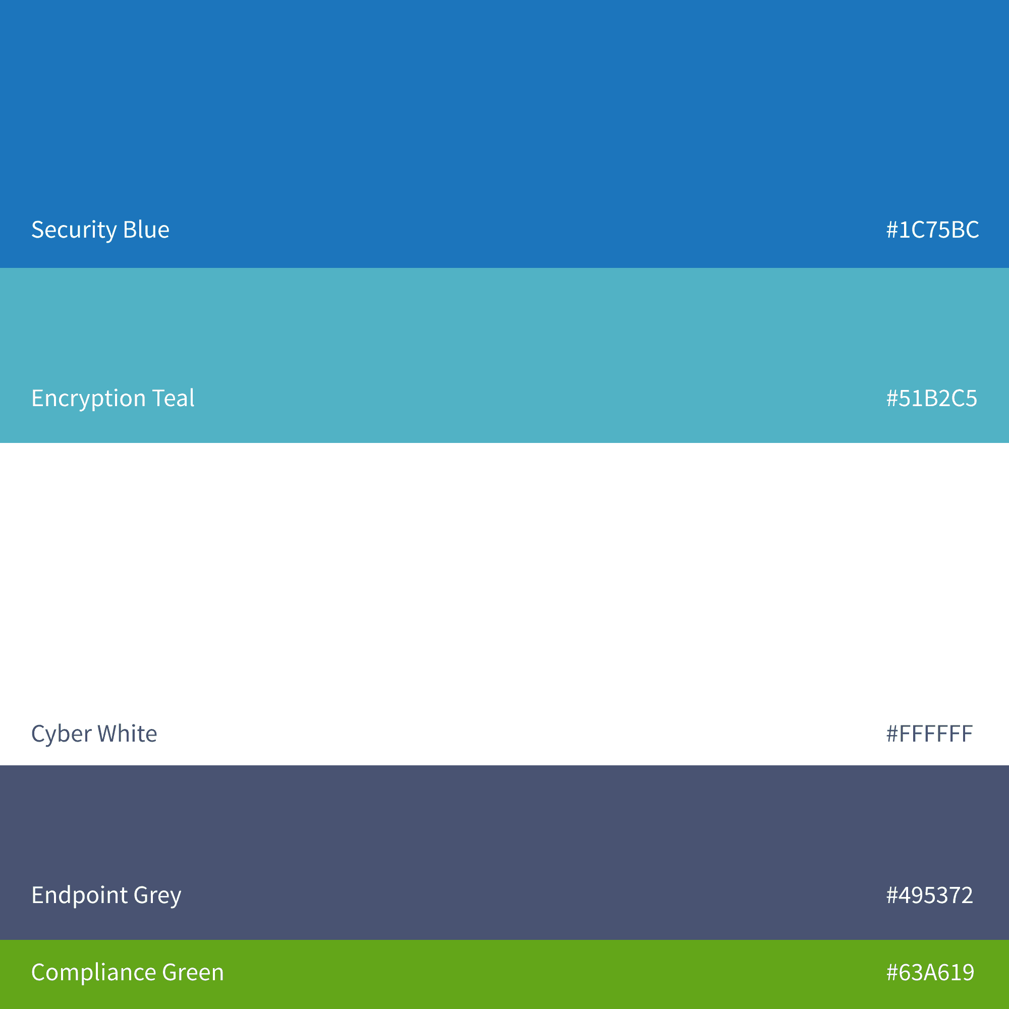
AsTech Consulting, a Silicon Valley-based cybersecurity firm, approached me to lead a complete brand overhaul. Their existing identity no longer aligned with their growth and ambition, and they needed a visual presence that would reinforce their expertise in cybersecurity risk management and assessment. The goal was to create a modern brand that positioned AsTech as a leader in the industry, while visually setting them apart from competitors.
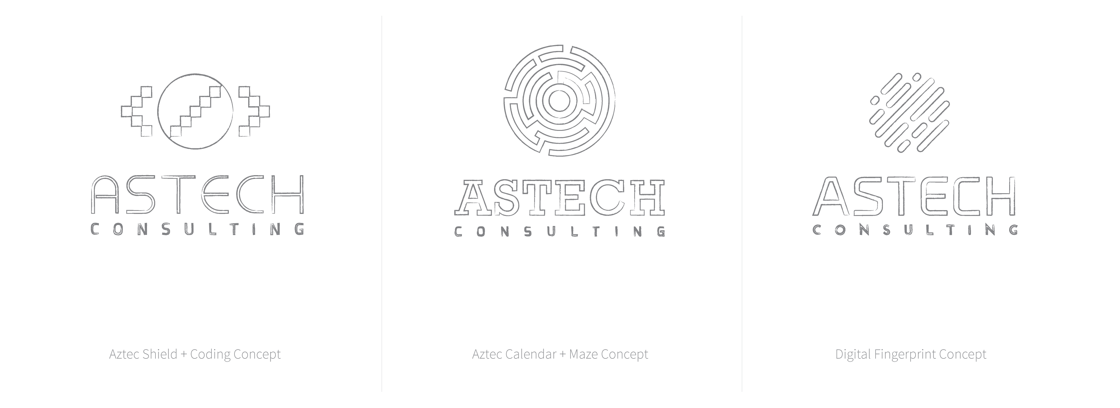
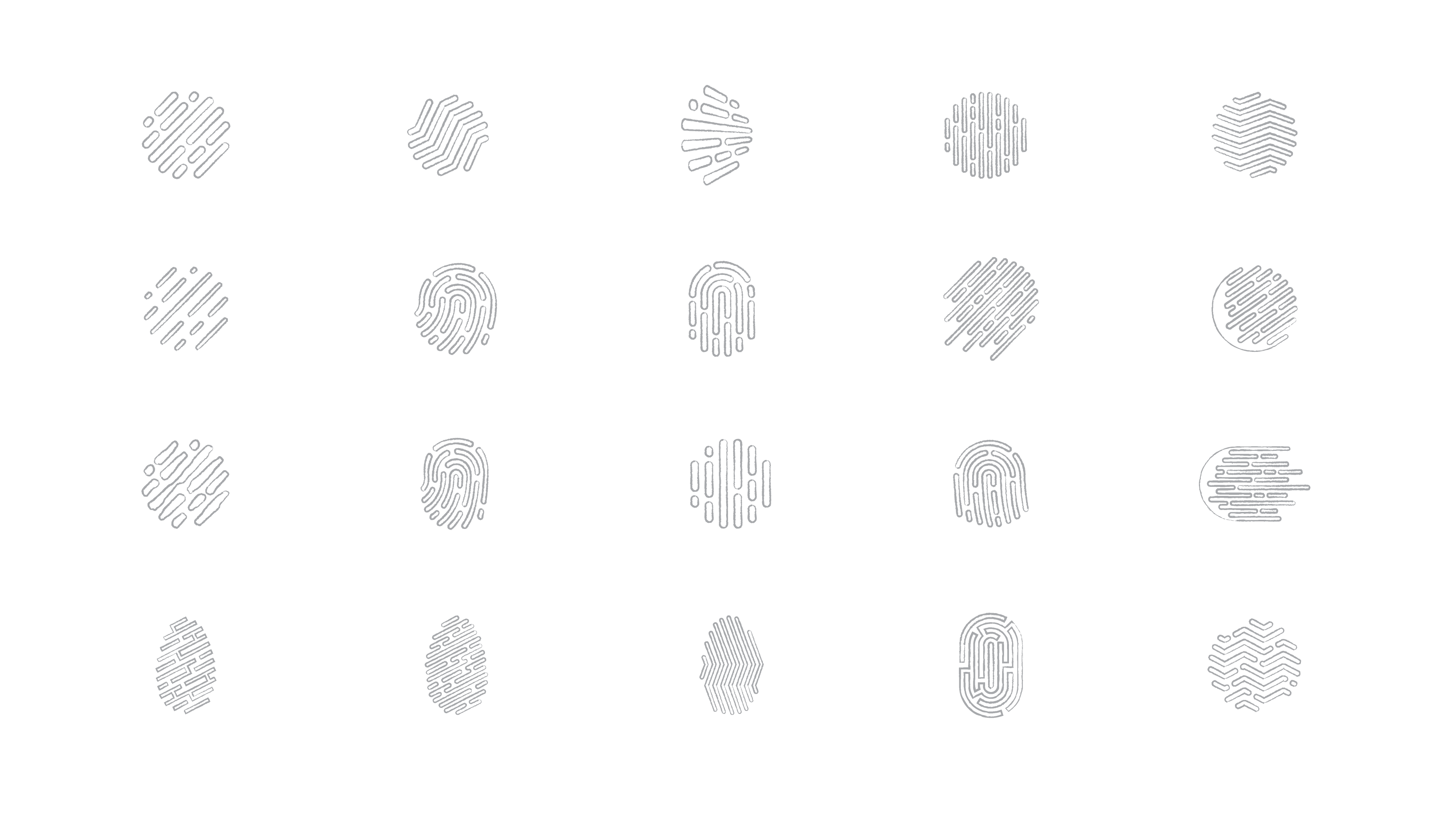
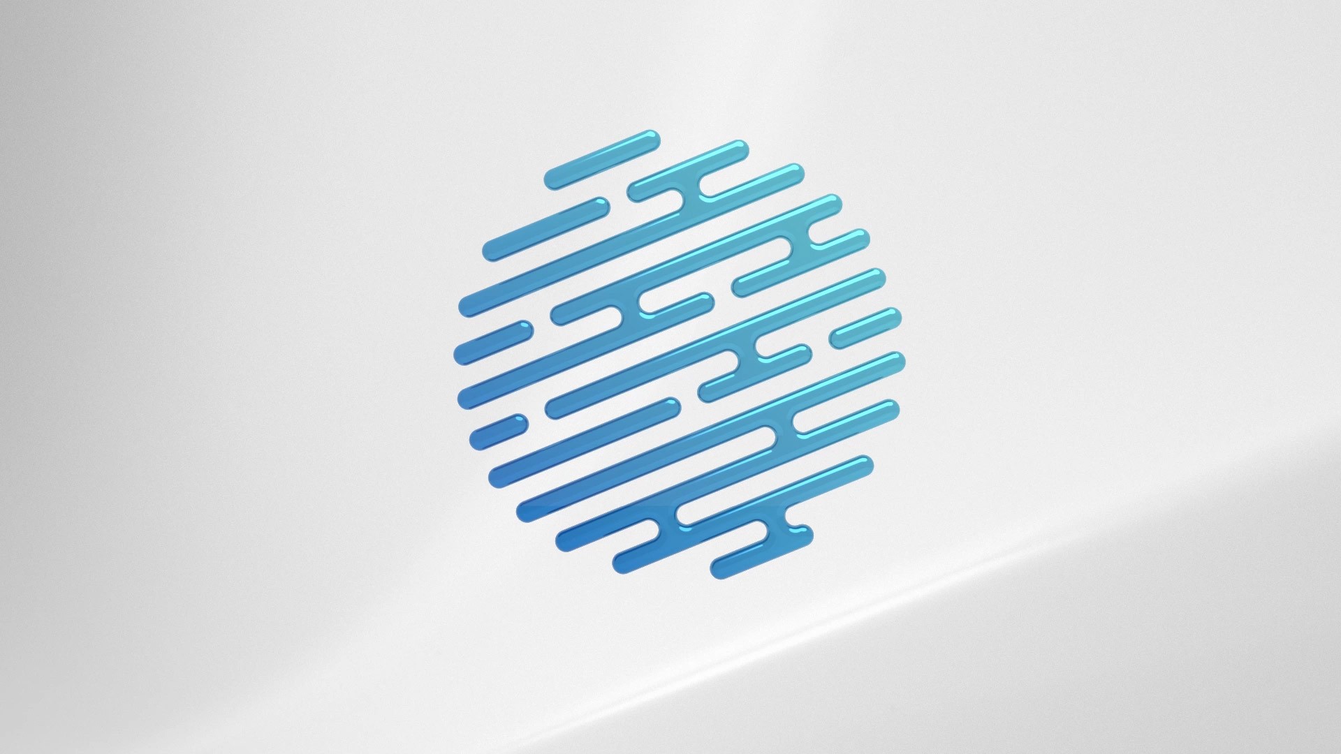
We began with an in-depth exploration of the pain points in their current branding, the core values they wanted to highlight, and the audiences they serve. From there, several concepts were developed, with the "digital fingerprint" resonating most with the leadership. This concept symbolized AsTech’s technological sophistication and commitment to security.
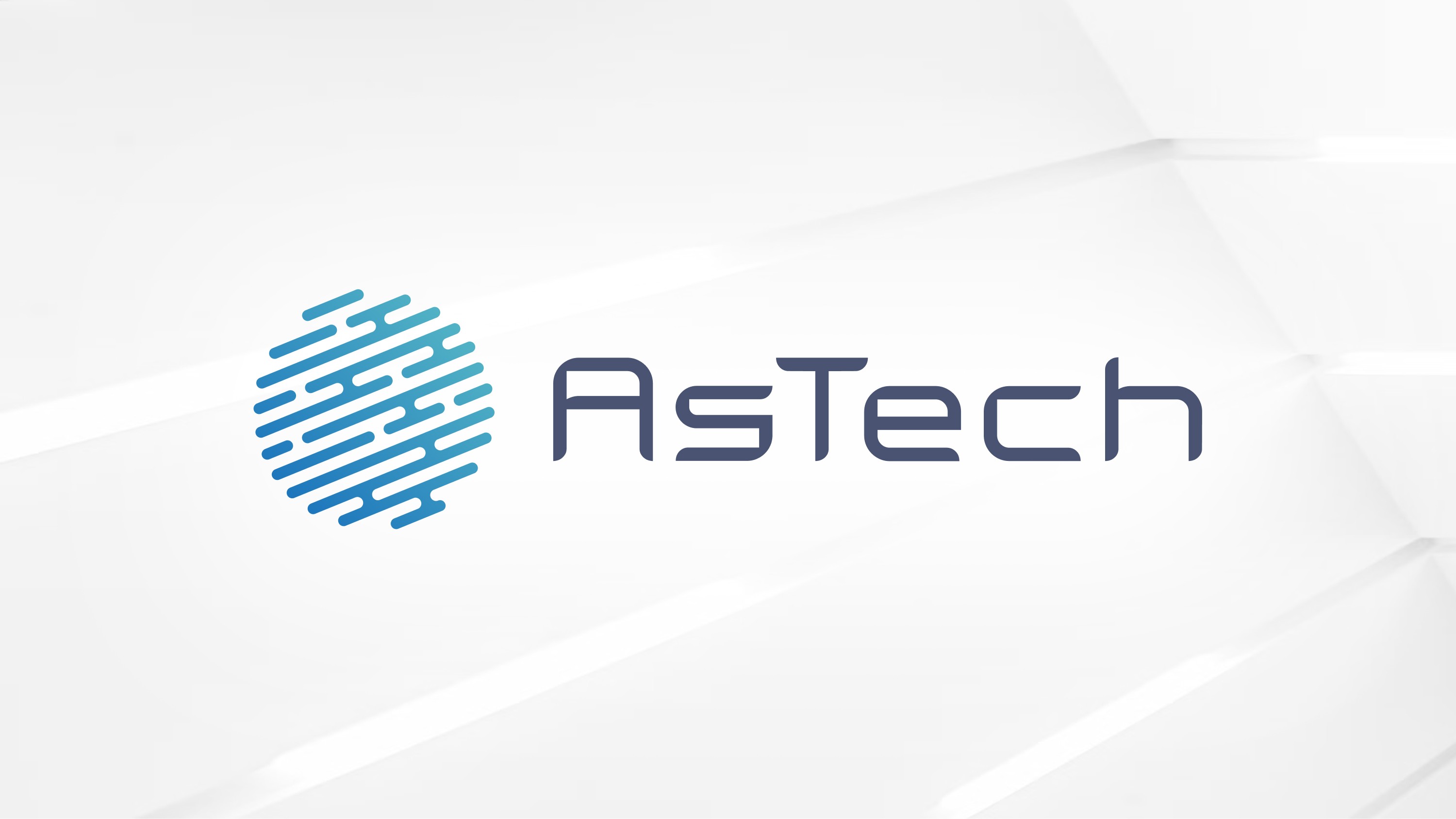
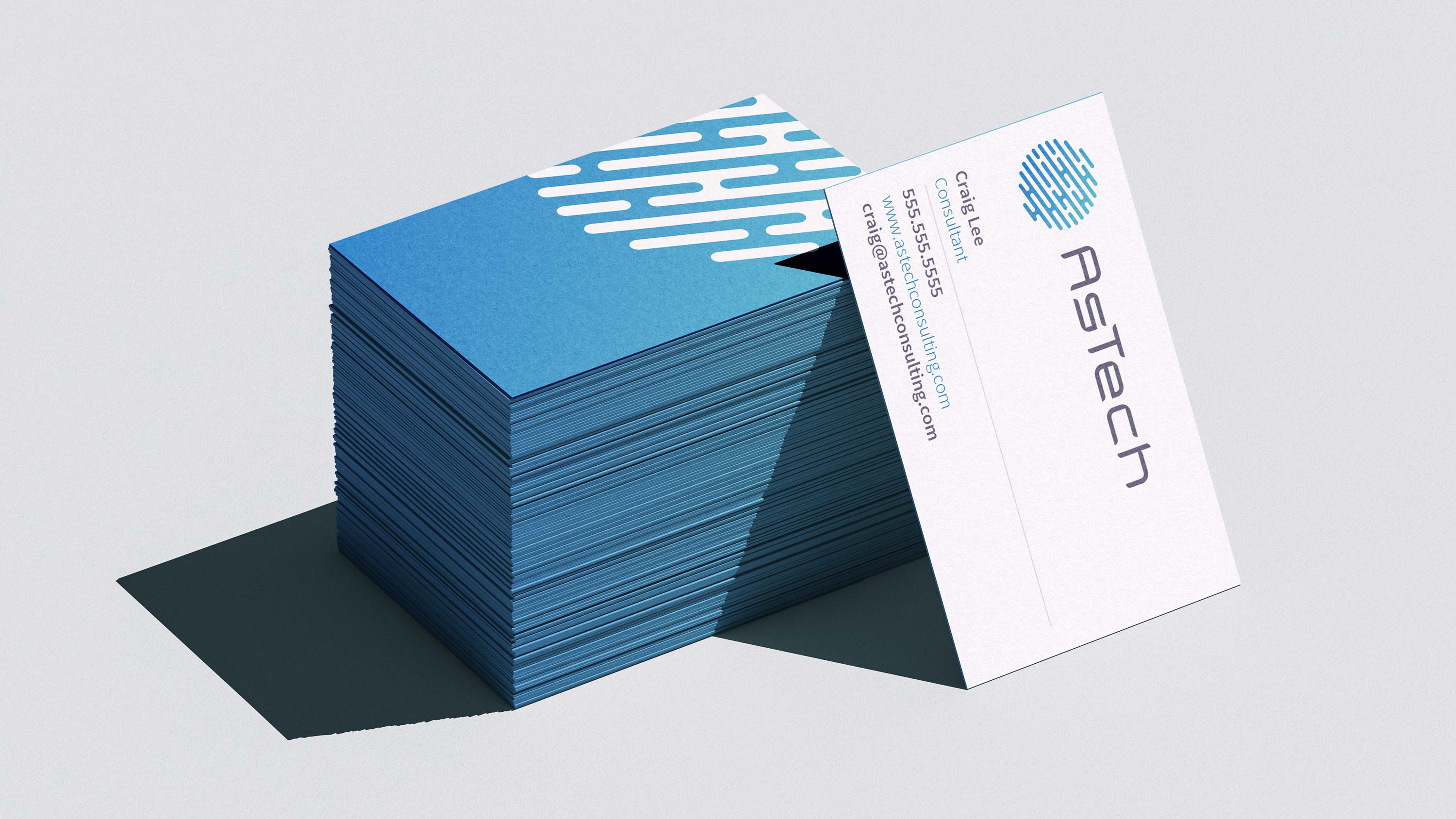
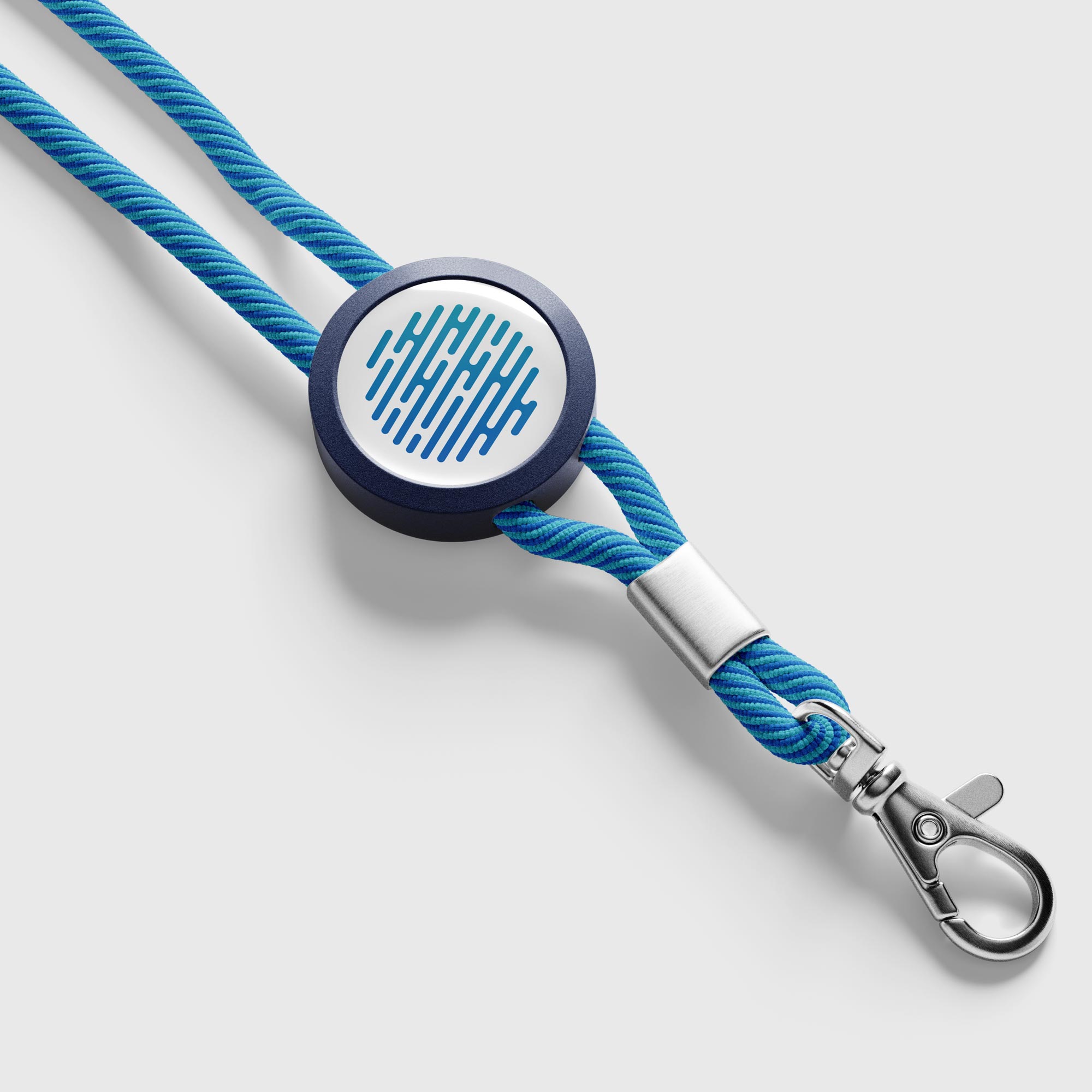
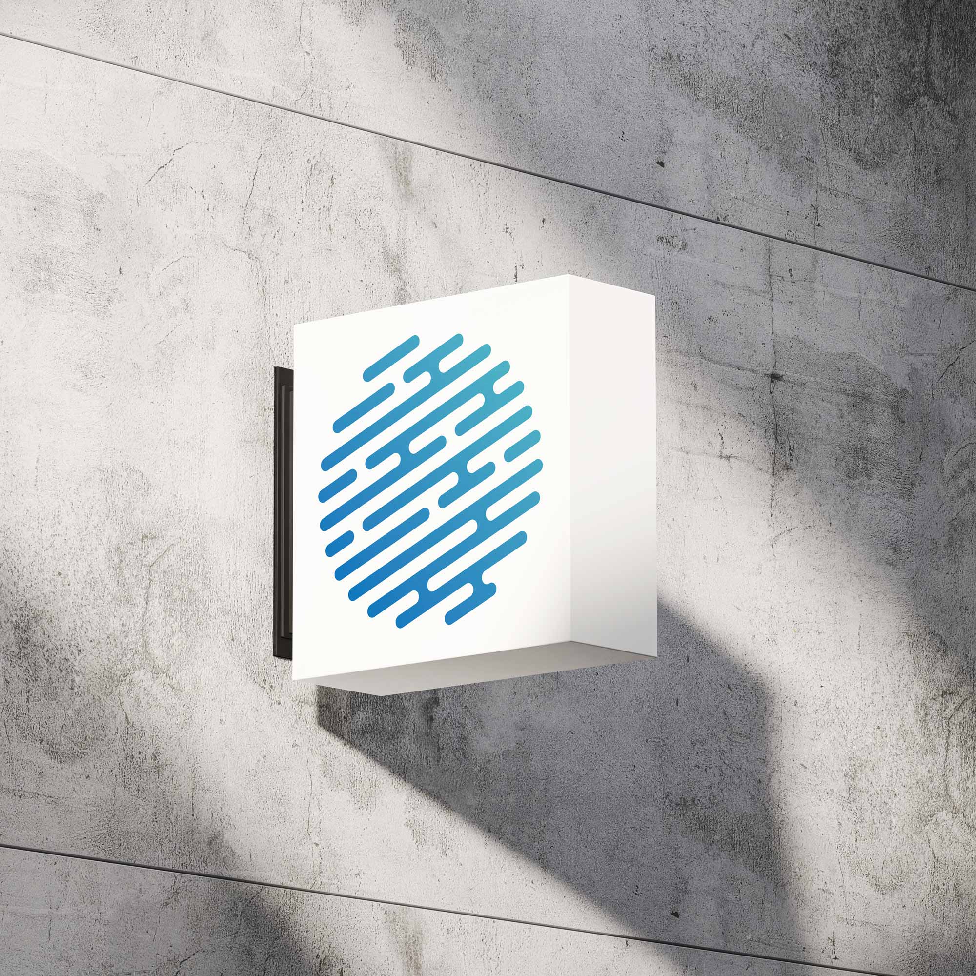
After some explorations and fine tuning, the final logo mark design featured 11 rows of round-capped lines forming a perfect circle. The upward, 22-degree angle represented innovation and progress, while the bold blue gradient evoked trust and growth. The circular shape symbolized "perfection" which reflected AsTech's unblemished 20-year history of never experiencing a security breach. And the interconnected points between the lines symbolized "knowledge transfer at every opportunity," a core value emphasized throughout the rebranding process.
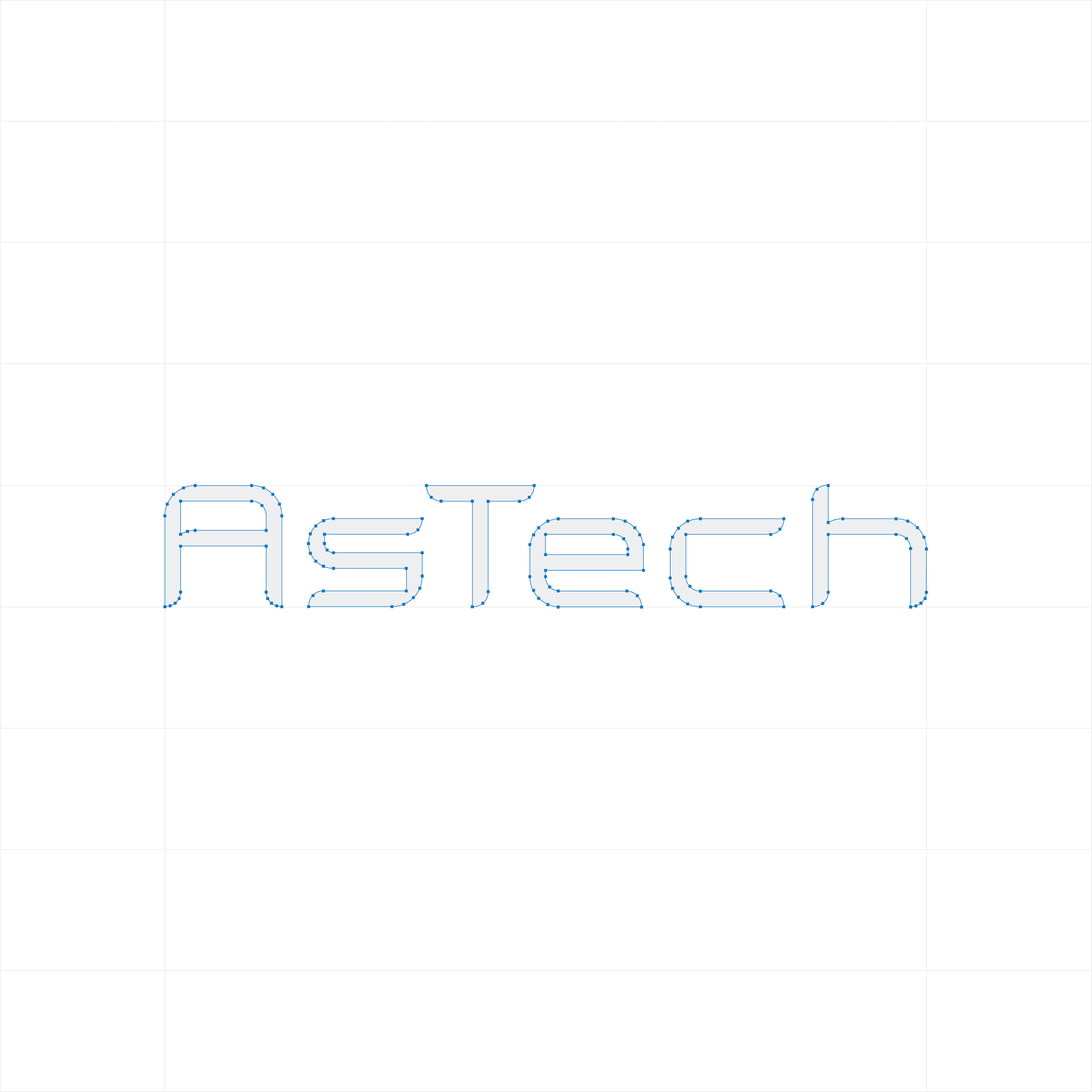
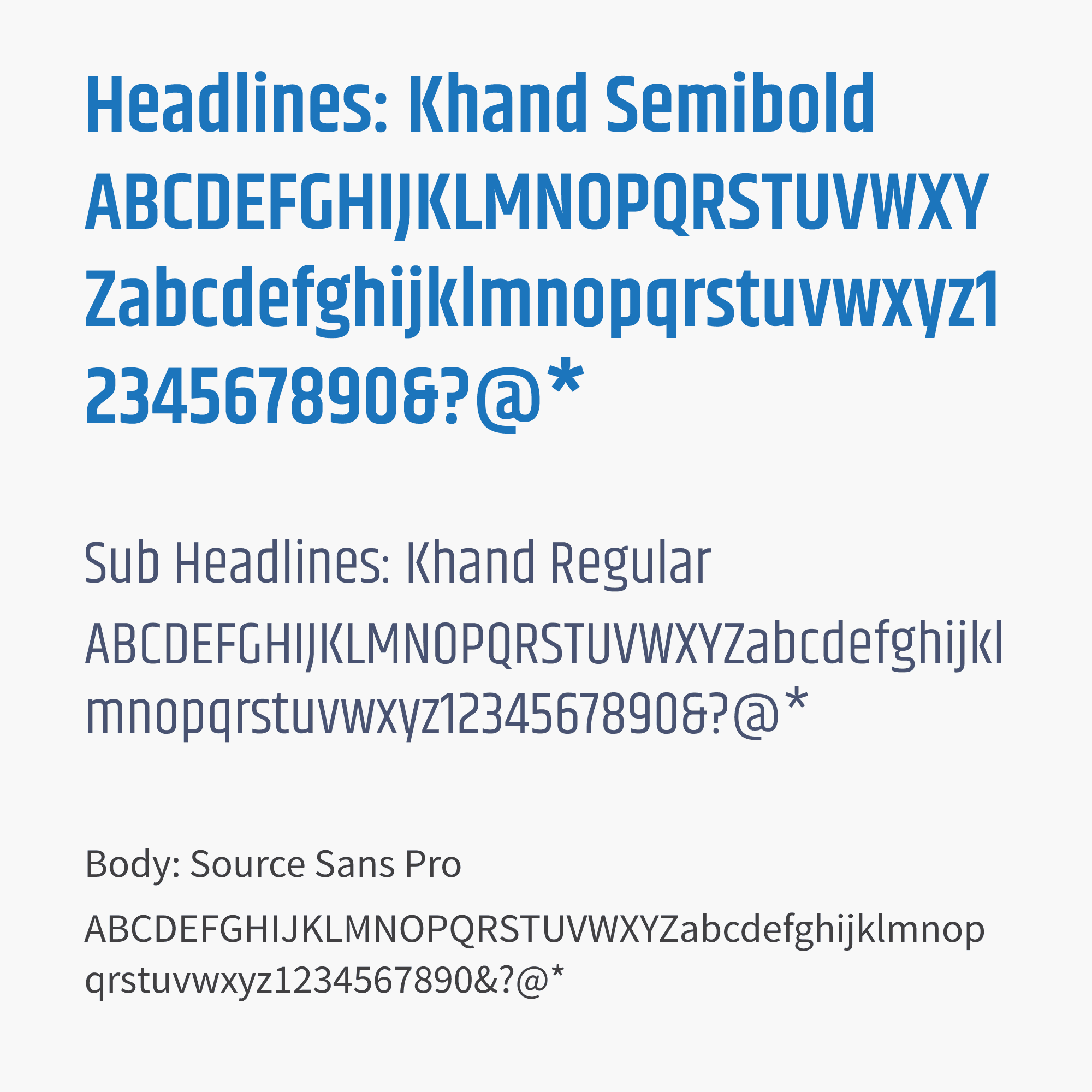
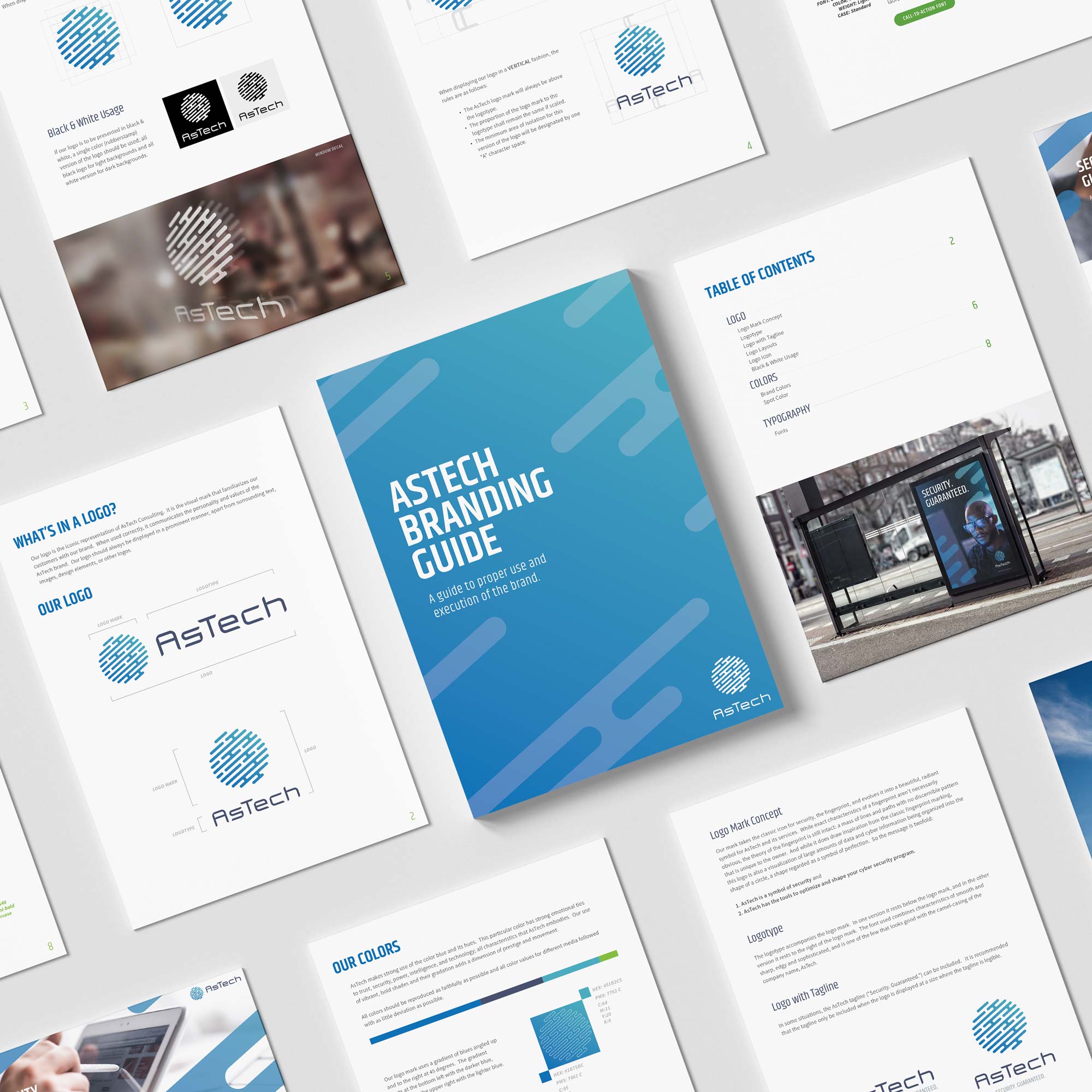
Part of the rebrand included simplifying the company name from "AsTech Consulting" to "AsTech," underscoring their growing list of offerings. The camelCased typography, which was a requirement from the start, added distinctiveness, but the challenge was finding the right font. We ultimately selected Cilogie by Benoît Sjöholm, which struck the perfect balance between modern, tech-forward aesthetics and legibility across various sizes and mediums.
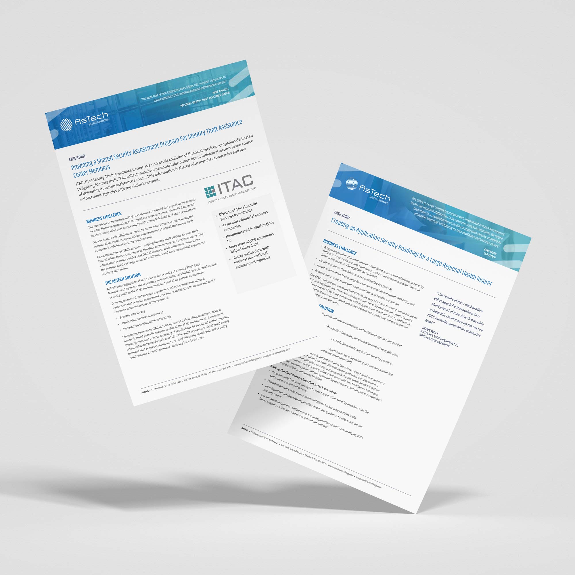
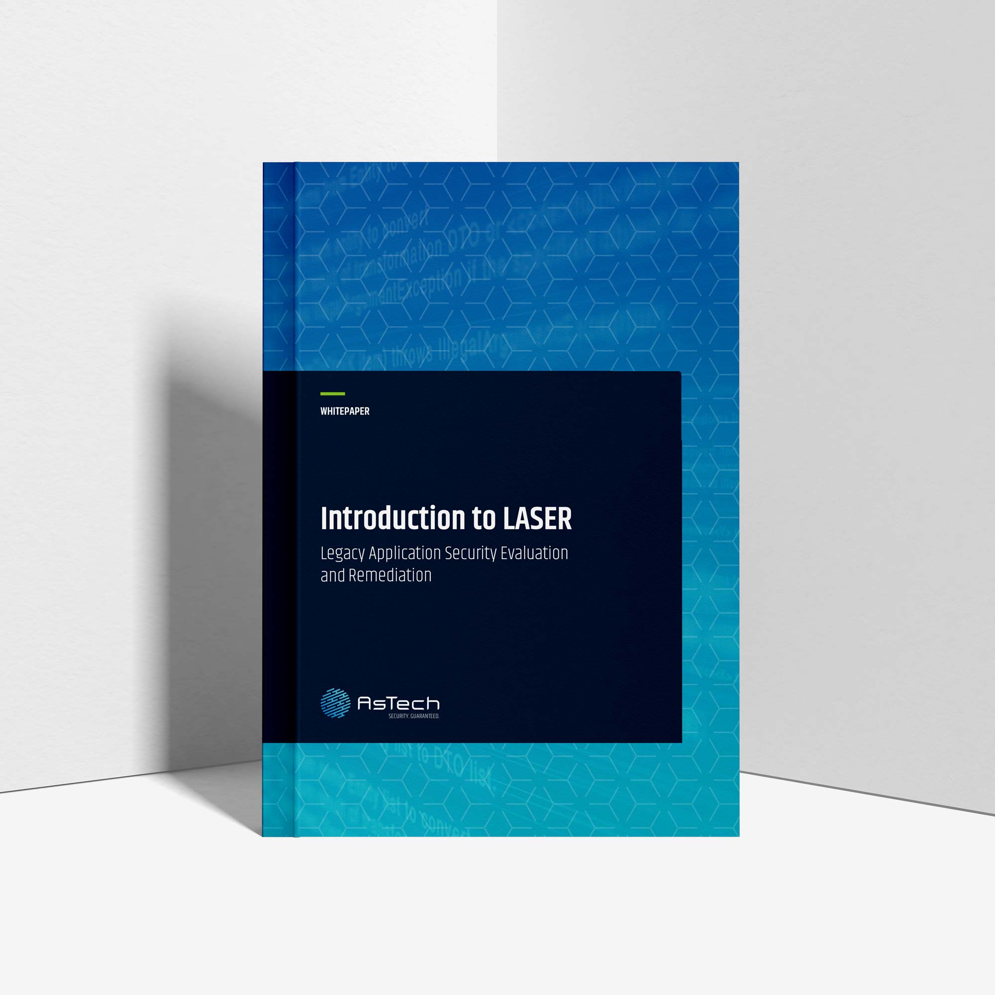
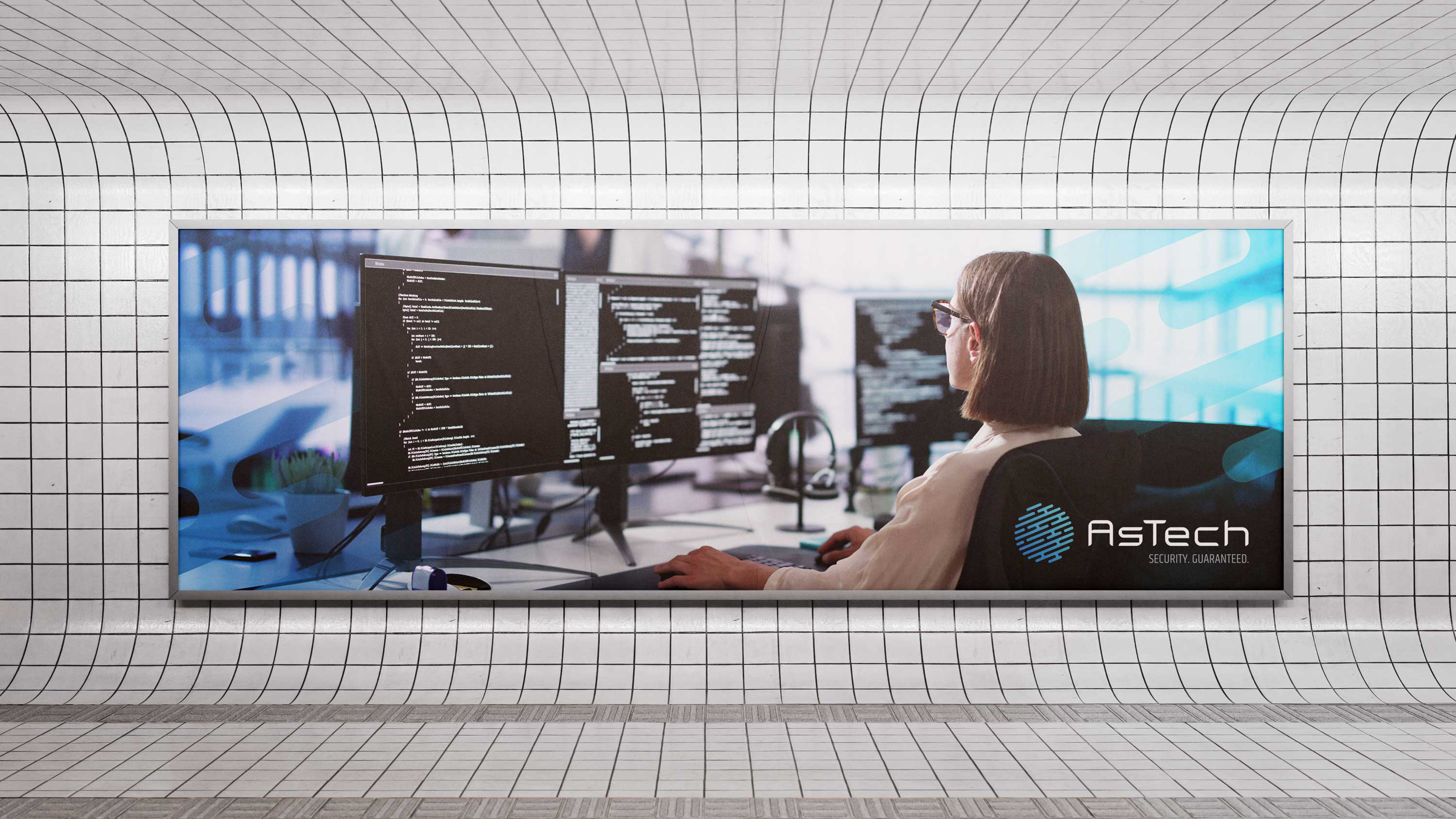
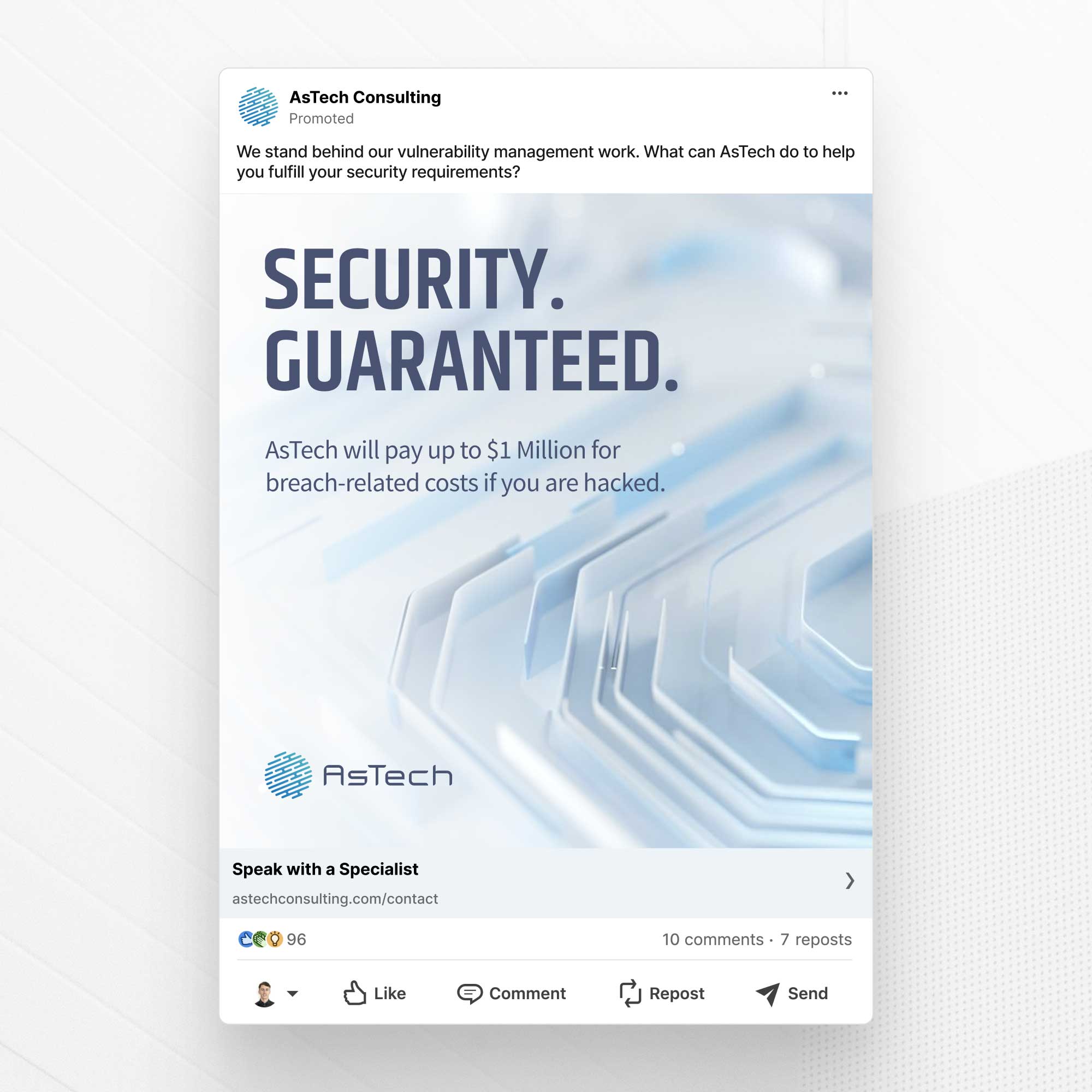
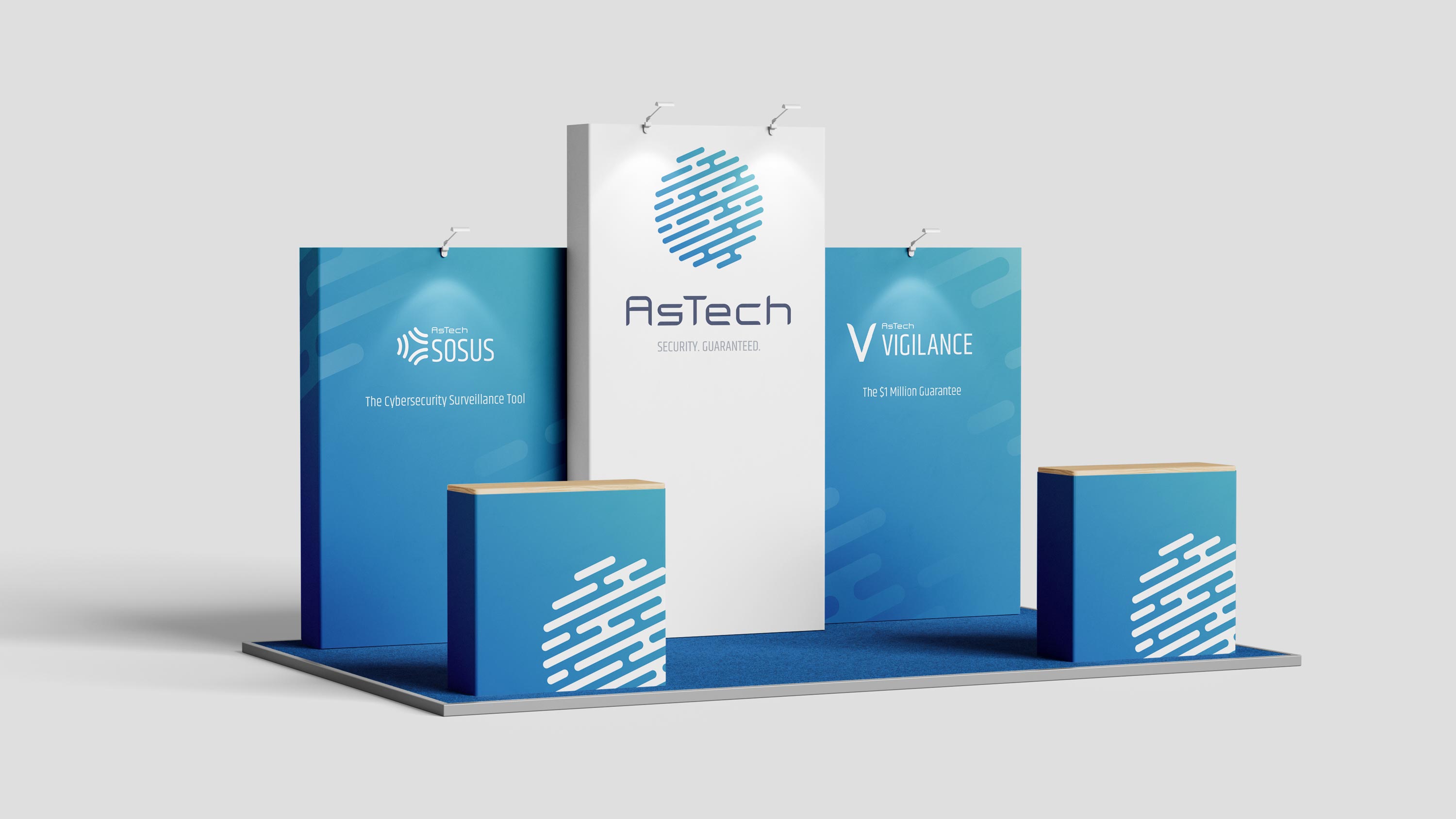
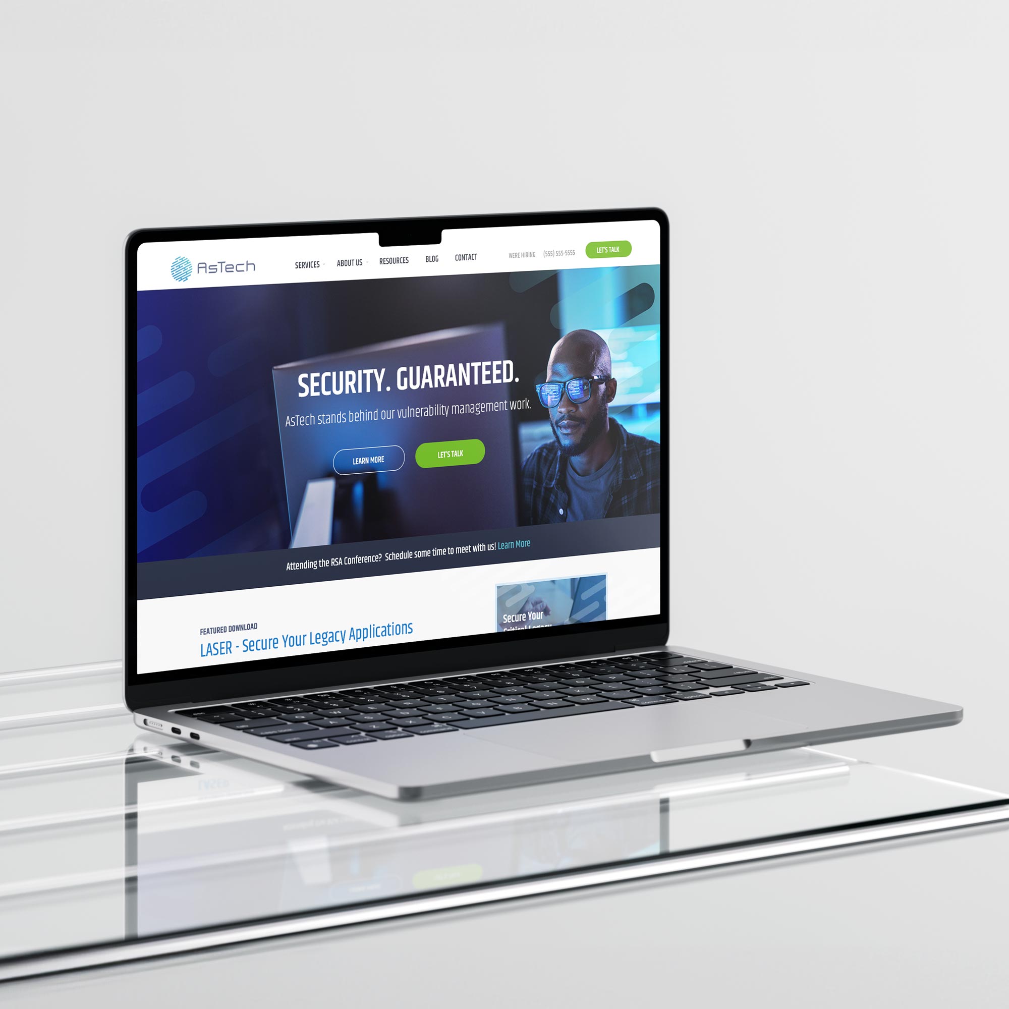
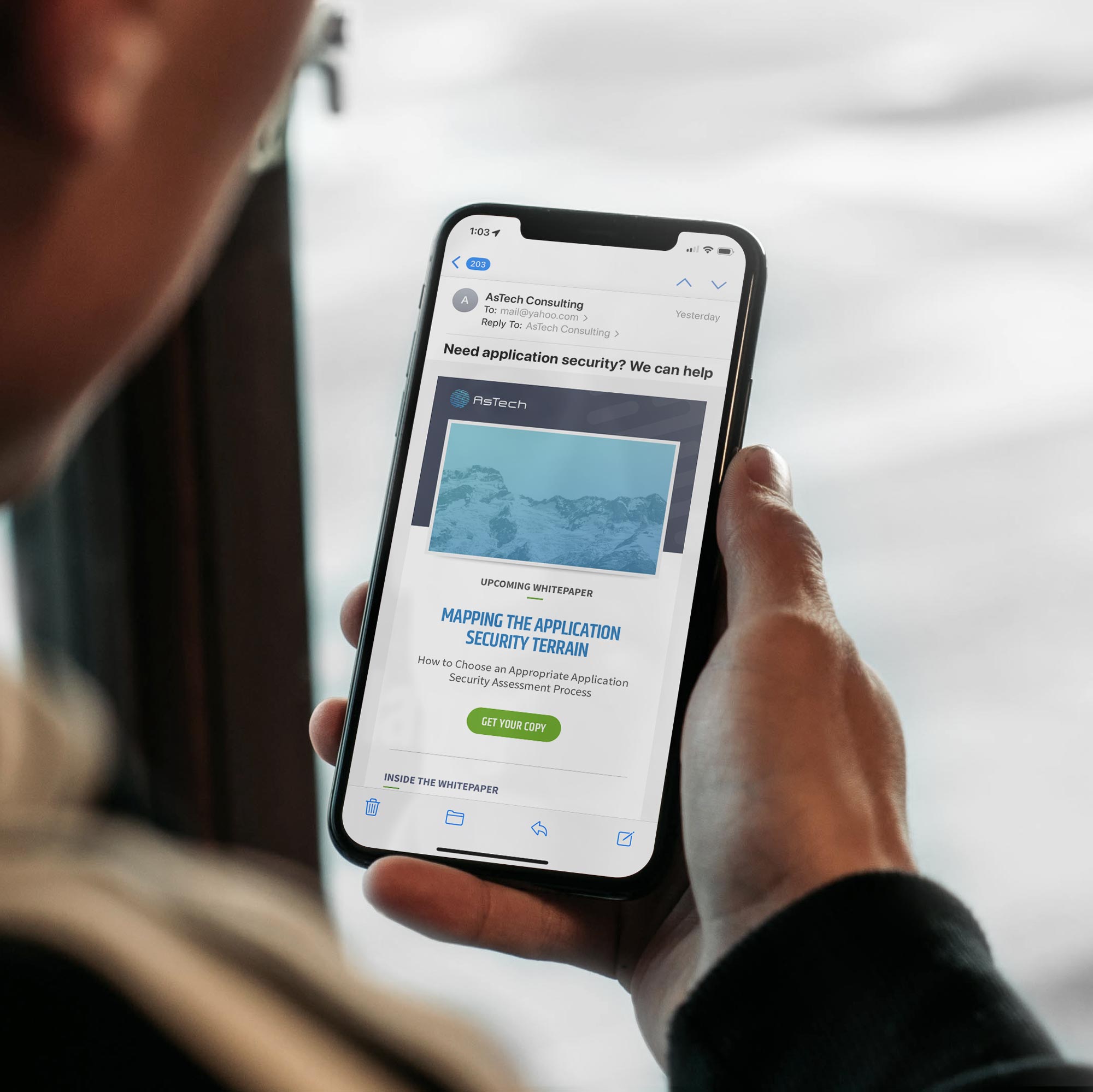
Following the successful rebrand, our collaboration continued with the design and maintenance of their website, as well as the creation of marketing collateral to ensure brand consistency across all touchpoints.
/ Credits
Client:
AsTech Consulting
Lead Designer:
Maxime Liberty-Point
/ Awards
International Design Awards - Honorable Mention
"
Max did an outstanding job leading the Zoom Mesh branding project. His creative vision and attention to detail brought the concept to life, seamlessly blending innovation and simplicity. Max’s ability to collaborate, refine complex ideas, and deliver a polished, cohesive visual brand made a significant impact. The final result not only exceeded expectations, but also aligned perfectly with our strategic goals. We couldn’t have asked for a better outcome."
Greg Reber / Founder and CEO / AsTech Consulting
OTHER
PROJECTS
Get in touch
